


Metric Heatmap
Use the Metric Heatmap for quick visual indicators on the current health of metrics. Each cell represents a specific metric and cells will remain green if the current status is healthy, otherwise red or orange depending on the severity of an active incident for that metric. Hovering over the cell will provide details on that metric and instance. Like most widgets, you can scope the results to specific instances and metrics using a variety of filtering options.
Use case
The Metric Heatmap widget is useful when:
-
You want to quickly view the current health of the metrics.
Examples
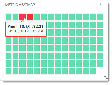
In this example, the widget shows the status of the metrics in an instance group. Healthy metrics are represented by green blocks. The red block represents an incident on the instance.
Configuration
When creating or editing a widget, a drawer that shows the widget's configuration options slides out from the right. Each configurable option is described in the following table.
|
Field |
Description |
|---|---|
|
Widget name |
Name of the widget as it appears on the dashboard. This field shows the default name of the widget. Select the pen icon to rename the widget. |
|
Metrics |
The selected metric's status is displayed on the widget. Use the search field to search for specific metrics. |
|
Filter Metrics |
You can also use the filters to fine-tune your search results. Values:
|
|
Instances |
Filter instances by the following: Values:
The health of the selected metrics will be visualized in the widget. |
|
Dashboard Scoping Adherence |
Enabling this option will allow you to bypass Dashboard-level scoping. |