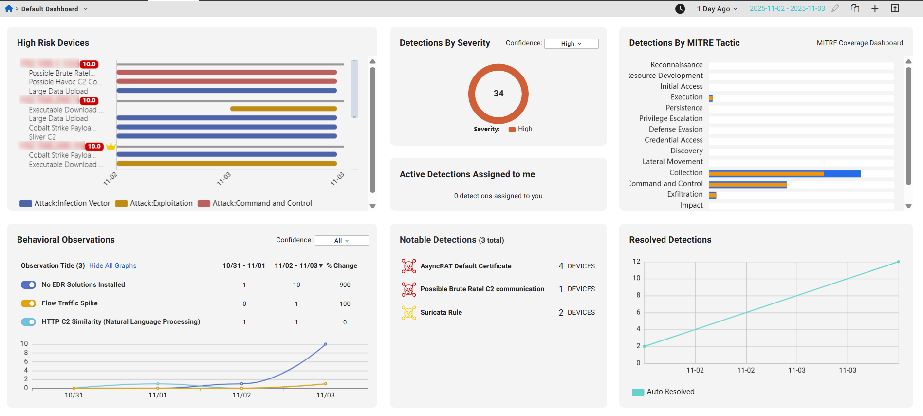
Fortinet white logo
Fortinet white logo

User Guide

Dashboard

Dashboard

The Default Dashboard organizes detection activity into interactive widgets that display high-risk devices, detection trends, severe threats, and resolved issues over time, helping analysts quickly review threats and prioritize their next steps.

The global date picker (located above the Detections by MITRE Tactic widget) applies a selected time range across multiple widgets, ensuring consistent context when reviewing historical data. Analysts can identify high-risk devices, examine detection severity by confidence level, and monitor notable patterns such as new or spiking detections. Additional widgets present detections by MITRE ATT&CK® tactics, behavioral observations, and resolution trends, providing structured insights for threat analysis and response.

The default dashboard features a clean, modern layout with enhanced functionality and rich visualizations. Its design is centered around analyst workflows and risk-based prioritization. All widgets (both default and custom) adopt a simplified style for a streamlined appearance. Widgets load in a structured sequence to ensure visual consistency during page loading.

Core functionality:
  • Identify high-risk devices by reviewing risk scores and crown icons, and open the entity panel for detailed context.
  • Review detection severity using confidence-level filters and switch between severity levels with dropdown controls.
  • Monitor notable detections with tags such as New or Spike to spot emerging or unusual activity.
  • Explore detections by MITRE tactic and track resolved detections with visualizations.
  • Access behavioral observations and other widgets for additional context.
  • Adjust the timeline to view historical data and hover over detections for quick access to details or context.

Widget

Description

High Risk Devices

Displays only devices with high risk and active detections. It highlights the top 5 high-risk devices, similar to those shown on the Detection Device Timeline page.

Devices are sorted by risk score (displayed next the device IP). Click the device IP to open the Entity Panel.

Hover over a bar in the chart to view details about the detection. Click the Detection Detail button to quickly navigate to the detection detail page for the selected detector. Click the Detection Context button to view the detections and observations related to this IP on the Detection Context page.

Click the widget top open the Detection Device Timeline page.

Detections By Severity

Displays the number of detections by confidence level (High, Moderate, Low or All). Use the dropdown menu to change the confidence level.

Click the widget name to open the Detections Table.

Active Detections Assigned to me

Displays the number of detections assigned to you. Click the widget name to open the Detections Table.

MITRE ATT&CK

Displays detections organized by the MITRE ATT&CK® framework. Each detection activity includes two bars: orange shows the previous time period, and blue shows the current range.

  • Hover over bars to view detection counts.
  • Click bars to open the Detections Table.
  • Click MITRE Coverage Dashboard to open the MITRE ATT&CK Matrix.

Row names may vary depending on account coverage.

Behavioral Observations

Shows behavioral observations from the past two time ranges (1 day, 1 week, 2 weeks, 30 days).

  • Click the widget title to open the Behavioral Observations page
  • Click an observation title to view details
  • Hover over graph data points for details
  • Use Hide All Graphs and toggles to filter observations
  • Use the Confidence dropdown to filter by level (All, High, Moderate, Low)

Notable Detections

Displays active detections with the highest severity and detection count.

The New and Spike labels highlight new detections and spikes in detection activity.

  • New indicates that there were no active detections during the baseline period (defined as 30 to 7 days ago), but at least one detection has occurred in the past 7 days.

  • Spike indicates that the number of active detections in the past 7 days is more than three times higher than the baseline count.

Resolved Detections

Shows daily counts of resolved detections over time, including Total, Average, and Maximum.

  • Click a data point or the Total count to view resolved detections in the Detections Table

Shared dashboards

When a user opens a shared dashboard with query charts, a new investigation is created in their own account. This ensures that:

  • The query results shown are based on the current account's data, not the dashboard creator's.

  • Clicking the chart title also opens the query inside the investigation specific to the current account.

When a user clones a dashboard that contains query charts, a new investigation is automatically created in the user's account for each query chart widget. This ensures that the cloned dashboard runs fresh queries and displays results based on the current account data. The investigation is independent of the original dashboard and tailored to the account.

Users with only the Admin role (and no additional roles like User) will not see dashboards that contain query charts. This ensures that only users with the appropriate permissions can access dashboards with query-based data.

Dashboard

Dashboard

The Default Dashboard organizes detection activity into interactive widgets that display high-risk devices, detection trends, severe threats, and resolved issues over time, helping analysts quickly review threats and prioritize their next steps.

The global date picker (located above the Detections by MITRE Tactic widget) applies a selected time range across multiple widgets, ensuring consistent context when reviewing historical data. Analysts can identify high-risk devices, examine detection severity by confidence level, and monitor notable patterns such as new or spiking detections. Additional widgets present detections by MITRE ATT&CK® tactics, behavioral observations, and resolution trends, providing structured insights for threat analysis and response.

The default dashboard features a clean, modern layout with enhanced functionality and rich visualizations. Its design is centered around analyst workflows and risk-based prioritization. All widgets (both default and custom) adopt a simplified style for a streamlined appearance. Widgets load in a structured sequence to ensure visual consistency during page loading.

Core functionality:
  • Identify high-risk devices by reviewing risk scores and crown icons, and open the entity panel for detailed context.
  • Review detection severity using confidence-level filters and switch between severity levels with dropdown controls.
  • Monitor notable detections with tags such as New or Spike to spot emerging or unusual activity.
  • Explore detections by MITRE tactic and track resolved detections with visualizations.
  • Access behavioral observations and other widgets for additional context.
  • Adjust the timeline to view historical data and hover over detections for quick access to details or context.

Widget

Description

High Risk Devices

Displays only devices with high risk and active detections. It highlights the top 5 high-risk devices, similar to those shown on the Detection Device Timeline page.

Devices are sorted by risk score (displayed next the device IP). Click the device IP to open the Entity Panel.

Hover over a bar in the chart to view details about the detection. Click the Detection Detail button to quickly navigate to the detection detail page for the selected detector. Click the Detection Context button to view the detections and observations related to this IP on the Detection Context page.

Click the widget top open the Detection Device Timeline page.

Detections By Severity

Displays the number of detections by confidence level (High, Moderate, Low or All). Use the dropdown menu to change the confidence level.

Click the widget name to open the Detections Table.

Active Detections Assigned to me

Displays the number of detections assigned to you. Click the widget name to open the Detections Table.

MITRE ATT&CK

Displays detections organized by the MITRE ATT&CK® framework. Each detection activity includes two bars: orange shows the previous time period, and blue shows the current range.

  • Hover over bars to view detection counts.
  • Click bars to open the Detections Table.
  • Click MITRE Coverage Dashboard to open the MITRE ATT&CK Matrix.

Row names may vary depending on account coverage.

Behavioral Observations

Shows behavioral observations from the past two time ranges (1 day, 1 week, 2 weeks, 30 days).

  • Click the widget title to open the Behavioral Observations page
  • Click an observation title to view details
  • Hover over graph data points for details
  • Use Hide All Graphs and toggles to filter observations
  • Use the Confidence dropdown to filter by level (All, High, Moderate, Low)

Notable Detections

Displays active detections with the highest severity and detection count.

The New and Spike labels highlight new detections and spikes in detection activity.

  • New indicates that there were no active detections during the baseline period (defined as 30 to 7 days ago), but at least one detection has occurred in the past 7 days.

  • Spike indicates that the number of active detections in the past 7 days is more than three times higher than the baseline count.

Resolved Detections

Shows daily counts of resolved detections over time, including Total, Average, and Maximum.

  • Click a data point or the Total count to view resolved detections in the Detections Table

Shared dashboards

When a user opens a shared dashboard with query charts, a new investigation is created in their own account. This ensures that:

  • The query results shown are based on the current account's data, not the dashboard creator's.

  • Clicking the chart title also opens the query inside the investigation specific to the current account.

When a user clones a dashboard that contains query charts, a new investigation is automatically created in the user's account for each query chart widget. This ensures that the cloned dashboard runs fresh queries and displays results based on the current account data. The investigation is independent of the original dashboard and tailored to the account.

Users with only the Admin role (and no additional roles like User) will not see dashboards that contain query charts. This ensures that only users with the appropriate permissions can access dashboards with query-based data.