


Dashboards, Templates, and Widgets
Overview
Dashboards
A Dashboard is default landing and home page after a user logs into FortiSOAR.
|
By default, FortiSOAR includes the System Dashboard, which is displayed on all users when they log into FortiSOAR for the first time. Only users who have a minimum of Read and Update permission on the |
Dashboards and reports have good performance since only the required content is loaded and lazy loading of the content is enabled.
Templates
The FortiSOAR interface is rendered using Templates, which can be modified as needed to suit your specific purposes better. Currently, Templates are system-wide, meaning everyone will see the same Template on every interface, e.g., your Incidents screen would be the same as all others. The system interface is composed of View Templates, which are JSON definitions of the interface structure composed of widgets.
Widgets
Widgets render information for the visual display inside View Template. Widget types vary such that specific widgets only correspond to certain view types. For example, the detail view has some exclusive widgets, such as Visual Correlation, Comments, Timeline, etc.
|
|
The |
Using Dashboards
Dashboards are the users' default home page. Users use the dashboard and at one glance see what are the critical tasks that they need to work on to be effective.
When an administrator modifies dashboards, those modifications apply to the system and users. Administrators assign dashboards to users based on their roles. If a non-admin user modifies the dashboard, then changes are applicable only to that user. However, both types of users can see the Edit Dashboard option.
For Users
You can go to your Dashboard (Home) page and use it to determine "What's important to me right now?" To effectively accomplish answering this question, you must scope your Home page to match up to your operational goals. For example, if you are a user who works on alerts, then you can customize your Dashboard to display alerts that are Critical and High. Using the dashboard, you can then immediately prioritize your work based on the critical and high alerts.
For Administrators
Administrators create dashboards that are applicable throughout the application and are assigned to users based on their roles. Presented here are some options of how administrators can leverage the Dashboard with a specific widget set and increase effectiveness across their organization.
Operation focus
For organizations where Task management is a key focus of using the FortiSOAR platform, tailor the Dashboard to display the user's work.
For example, you can create a dashboard that displays alerts that are Critical and High and then assign them to users who have a role of handling alerts. Users can prioritize their work looking at their Dashboard, which is displaying the Critical and High alerts.
Analytics focus
For organizations where analytics is a key focus of using the FortiSOAR platform, tailor the Dashboard to display trends.
For example, you can create a dashboard that displays the number and type of alerts that are created daily, weekly, or monthly and then assign them to users who have a role of an analyst. Analysts can view and analyze the dashboard and come up with solutions. If for example, the dashboard displays an increase in the number of instances of alerts of type Malware over the period of three months, analysts analyze the dashboard and come up with mitigation solutions.
Strategic focus
For organizations where strategizing is a key focus of using the FortiSOAR platform, tailor the Dashboard to display key performance indicators.
For example, you can create a dashboard that displays the number of incidents in the open state, per region, and severity for six months and then assign them to users who have a role of an executive. Executives can then view and analyze the dashboard and come up with solutions on how to optimize operational efficiency. If for example, the dashboard displays a consistent increase in the number of open incidents over the period of six months, executives can analyze the dashboard, understand the cause of this trend, such as is it because of inefficiencies or need for automation, or both and come up with informed solutions.
Process of creating or editing dashboards
To add or edit an existing dashboard, click the Actions icon ( ), which appears at the top-right corner of a page, and click New Dashboard or Edit Dashboard.

Templates are JSON definitions of the interface structure composed of widgets. Widgets are configurable interface elements that are used to represent data, such as charts or lists visually.
|
|
If you have changed a dashboard that an administrator has assigned to you, then you will not be able to view the administrator changes to that dashboard. To view the administrator changes to the report, click Actions > Reset to Original State. |
For information on using templates, see the Using Templates section and for information on widgets, see the Using Template Widgets section.
Permissions required for modifying dashboards
|
Only when an administrator, modifies dashboards, those modifications are applicable across the system and applicable to users, based on their roles. |
To view dashboards, you must be assigned a role that has Read permissions on the Application and Dashboard modules, and the dashboard must be assigned to your role.
If you are assigned a role that does not have any permissions on the Dashboard module, your landing page will appear as shown in the following image:

To create and update dashboards, you must be assigned a role that has Read, Create, and Update permissions on the Dashboard module and Read permissions on the Application module. Additionally, if you also want to delete dashboards and configurations, you must be assigned a role that has Read, Create, Update, and Delete permissions on the Dashboard module and Read permissions on the Application module.
For users who should only be able to customize their own dashboards, and whose changes will not be visible to any other user, a role with, Update and Create permissions on the Dashboard module and Read permission on the Application module is sufficient. If such a user (a non-admin user) changes the dashboard, then a copy of the original dashboard is created and those changes are visible to only that particular user and not to other users.
For users who should be able to customize dashboards, and whose changes should be visible to all users who have access to that dashboard, a role that has Read and Update permissions on the Dashboard module and Read permissions on the Application and Security modules must be assigned. If you have these permissions, then the changes are made in the original dashboard and these changes are visible to all the users who have access to the dashboard.
In addition to the appropriate permissions as mentioned above, users also require to have appropriate rights on the module for which they want to create or edit dashboards. Since if users do not have Module Read permissions on the module that they want to consume in the dashboard, then they will not be able to view the details of that module in the dashboard. For example, if you have Module Read permissions on the Alerts module but not on the Incidents module, then you can update dashboards that consume Alerts as their data source. However, if you try to update a dashboard that consumes Incidents as the data source, FortiSOAR displays a message such as You do not have necessary permissions for Incidents.
Users: Working with dashboards
Administrators assign dashboards to you based on your roles, so that you can have access to multiple dashboards. You can customize your home page choosing a default dashboard from the dashboards assigned to you.
You can also add, edit, clone, import, export, and remove dashboards that are assigned to you.
|
|
You can create personalized dashboards based on your roles. Customizations that you make to your dashboards are visible and applicable only to you. Administrators must update the dashboard for the changes to apply to all users. Updates, including removal, and additions that administrators make to the dashboards apply to all users. |
Customizing your Home page
Administrators assign dashboards to you based on your roles, so that you can have access to multiple dashboards. When you log on to FortiSOAR to for the first time, by default your home page is set to the System Dashboard. You can customize your home page by selecting the default dashboard from the dashboards assigned to you, as follows:
- Log on to FortiSOAR.
- On the
Dashboardbar, the dashboards assigned to you are listed as a drop-down in the top bar.
View all the dashboards assigned to you. - Open the dashboard you want to set as your default by selecting the same from the drop-down list present in the
Dashboardbar, and then clicking the Actions icon () and selecting Set as default for me.
When you log on to FortiSOAR the next time, your home page is set as the selected dashboard.
Customizing your dashboards
To add or edit your dashboards:
- Log on to FortiSOAR.
-
On the
Dashboardbar, to add a new dashboard click the Actions icon and select the New Dashboard option. To edit an existing dashboard, click the Actions icon and select Edit Dashboard. - In the Template Title field, enter the template title.
- Click Add Row and structure the row by defining the number and layout of columns from the options displayed in Define a new structure.
-
Click Add Widget and from the Choose Widget dialog box, select the appropriate widget.
For information on widgets, see the Using Template Widgets section.
TheChoose Widgetdialog includes the categorization of different types of widgets that you can use to build dashboards or reports. For example, the Tabs widget is categorized as aStructurewidget, and the Richtext Content widget is categorized as aCustom Contentwidget. -
In the
Edit <name of widget>dialog, configure the widget properties, and click Save. -
Click Apply Changes.
To revert the changes, you have made to the template, click Revert Changes.
Using dashboards
To clone a dashboard:
- Log on to FortiSOAR.
- On the
Dashboardbar, click the Actions icon and select Clone Template. - Update the template title.
By default, the template title appears as cloned: name of the original template. - Update the template and widgets as required.
- Click Apply Changes.
To import a dashboard template:
Use the Export and Import Dashboard Template feature to share dashboards across users. If you see a dashboard that a colleague has created that you feel would be useful to you as well, then instead of you having to recreate the dashboard, your colleague can export the dashboard, and you can import it and start using the same.
|
|
You can only import a valid JSON template. The template that you import is only applicable to your dashboard. Administrators must import, update, and assign dashboards for the changes to apply to all users. |
- Log on to FortiSOAR.
- On the
Dashboardbar, click the Actions icon and select Import Dashboard. - In the
Import Dashboard Templatedialog box, drag-and-drop the JSON template file, or click to browse to the JSON template file. - Click Import.
If the file is in the appropriate JSON format, FortiSOAR displaysTemplate Imported successfully!
To export a dashboard template:
|
|
Dashboard templates get exported in the JSON template. |
- Log on to FortiSOAR.
- On the
Dashboardbar, click the Actions icon and select Export Template.
FortiSOAR downloads the template on your machine in the JSON format.
To remove a dashboard:
|
|
You can only remove dashboards that you have added. You cannot remove the System Dashboard or any dashboard that is created by the administrator. |
- Log on to FortiSOAR.
- Open the dashboard you want to remove by selecting the same from the drop-down list present in the
Dashboardbar, and then clicking the Actions icon and selecting Remove Dashboard. - On the Confirm dialog, select OK.
Administrators: Working with dashboards
Administrators can perform all the tasks users can perform, which include customizing home pages and dashboards. Administrators also create and edit system-wide dashboards and assign dashboards to roles. To create system-wide dashboards, click the Actions icon and then select New Dashboard option, and then add the template name and widgets that you want in the dashboard. After you have completed creating a template, you must remember to assign the dashboard to the appropriate roles.
|
|
Updates, including removal, and additions that you make to dashboards apply to all users. |
Assigning dashboards to roles
|
|
You must have a minimum of "Read" permission on the Security module, apart from other appropriate privileges to perform this task. |
- Log on to FortiSOAR.
-
On the
Dashboardbar, select the dashboard that you want to assign to a role. -
Click the Actions icon and select Assign to Role OR
Click the Actions icon and select Edit Dashboard and then click the Assign To Roles or Number of Roles Assigned link.
This displays the Assign to Role (s) dialog in which you can select the role(s) to whom you which to assign the dashboard. -
In the Assign to Role(s) dialog box, select the role to which you want to assign the dashboard.
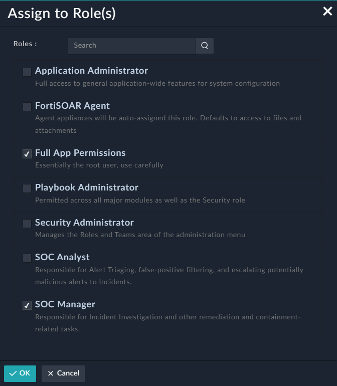
You can also search for a role in the Search text box. -
Click OK.
Users having the role specified will be able to see the dashboard(s) associated with that role the next time they log on to FortiSOAR.
Input Variables in Dashboards and Reports
You can define variables that you want to use in widgets as filters to consume inputs and create a dashboard or a report dynamically. Using input variables, you can filter data in a dashboard or report to display a particular set of data without having to define the same criteria in each widget in the dashboard. Once you configure the variable as a filter in widgets, the dashboard is displayed according to the filter value you have specified. You can now specify inputs for dashboards or reports, based on which dashboard or reports are updated dynamically to display the dashboard or report according to the updated input values.
Defining Input Variables
This procedure demonstrates how to define an input variable for a dashboard or report to display only those records that were modified in the last 7 days.
- Log on to FortiSOAR.
- On the
Dashboardbar, click the Actions icon and select Edit Dashboard. - On the
Template Editing Mode Enabledpage, click Configure Inputs. - In the
Configure Inputsdialog, configure the input variable according to your requirements:- (Optional) Select the Enable Auto-Refresh option to automatically refresh your dashboards or reports after the set time interval.
By default, the time interval is set at 10 minutes. You can modify the time interval according to your requirements. - Click Add New Input.
- From the Input Type drop-down list, select the type of field that is going to be applied as the input variable. You can choose from the following options: Text, Number, Date, Date Range, Picklist, or Lookup.
For our example, select Date Range. - In the Label field, type the name that describes this variable.
For our example, typeModified On.
The Identifier field gets automatically populated with the identifier based on the "Label" you have specified. In case of our example, the Identifier field is populated with the modifiedOn variable. The value that is present in the Identifier field is the key by which this variable will be identified. - (Optional) In the
Default Valuesection, choose the value based on which the dashboard will be displayed, by default. The date ranges are relative, i.e, relative to the current date. You can choose between a Relative date range or a Custom relative date range.
If you choose Relative, then you get a list of pre-defined relative date ranges such as Last 24 Hours, Last 30 Mins, etc. If you choose Custom, then you can specify a custom date/time range, such as Last 2 Hours. For more information, see Support for Custom Time Ranges in Filters. For our example, select Relative and then select Last 7 days.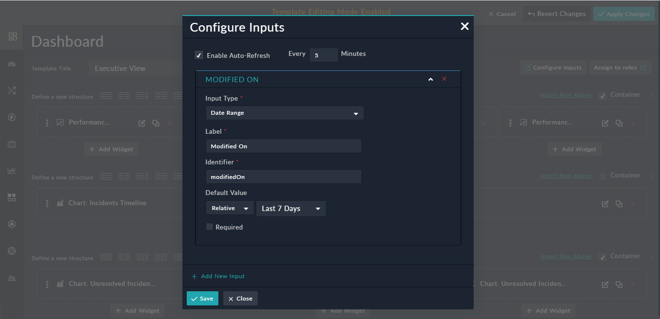
- (Optional) To make the input field mandatory, click the Required checkbox. If you select the Required checkbox, then the report or dashboard will not be displayed unless the user provides the input.
- (Optional) Select the Enable Auto-Refresh option to automatically refresh your dashboards or reports after the set time interval.
- (Optional) To define more input variables, click the Add New Input button.
- Click Save to save the variable(s).
The Date input type enables you to ask a user for a date based on which they want to filter the dashboard or report, using the Select Date link in the Default Value section. An example of using the Date input type would be to define the From Date, i.e., the date from when the user wants to view the report:

The Picklist input enables you to ask a user to select a value of an existing picklist based on which they can filter the dashboard or report. You can set a default value to filter the dashboard or report, for example, as shown in the following image, Phishing is selected in the Default Value field. This means that the report or dashboard, by default, will be filtered to display only those alerts that are of type Phishing.

The defined input variables can be seen on the Dashboard by clicking the Input button. However, to use the input variables for filtering the Dashboard, you must also configure them in the appropriate widgets, as specified in the following Configuring Input Variables section. Users can click Input on the dashboard or report and choose any other alert type for which they want to see the dashboard or report:

You can also select the Lookup option as an input type. The Lookup input enables you to ask a user to select a value of an existing lookup based on which they can filter the dashboard or report. For example, filtering an "Incident Summary Report" based on the user to whom that incident was assigned. You can also set a default value to filter the dashboard or report, for example, as shown in the following image, CS Admin is selected in the Default Value field. This means that the report or dashboard, by default, will be filtered to display the summary of the incident that has been assigned to "CS Admin".

The defined input variables can be seen on the Report by clicking the Input button. However, to use the input variables for filtering the Dashboard, you must also configure them in the appropriate widgets, as specified in the following Configuring Input Variables section. Users can click Input on the dashboard or report and choose any user for who they want to see the dashboard or report:

Configuring Input Variables
Once you complete defining the input variables, you must configure them in the widgets that require to consume the input variables that you have defined.
- Log on to FortiSOAR.
- On the
Dashboardbar, click the Actions icon and select Edit Dashboard. - Open the widget that is required to consume this input variable.
For example, in a Grid widget, that displays Alert records, you can add the Modified On filter in the Nested Filters component in the widget as shown in the following image: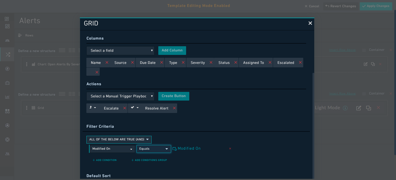
Important: "Lookup" Fields must be bound using UUID. For example, in case of the "Incident Summary Report", where you want to see the summary of the incident which is assigned to a particular user, you would add the filter such asUUID Equals Assigned To. For example, in a Chart widget, that displays newly added Incident records, you can add theAssigned Tofilter in the Nested Filters component in the widget as shown in the following image: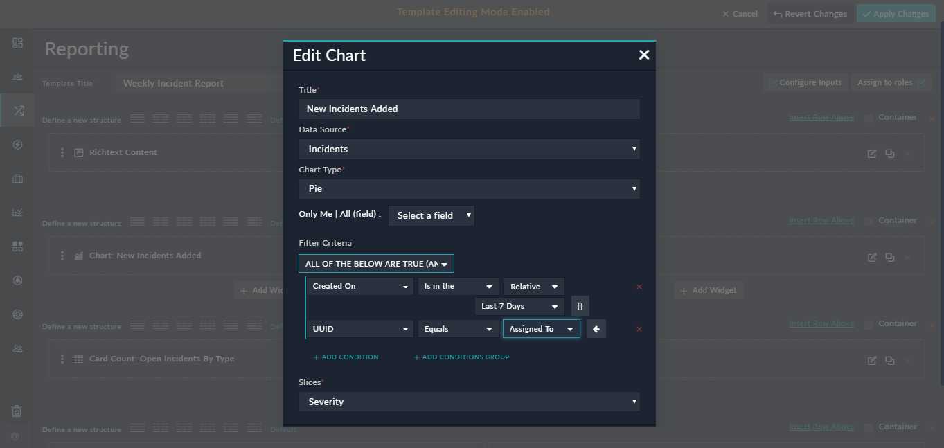
- Click Save.
Using Input Variables
Once input variables are defined for a dashboard, then you can dynamically specify inputs to the dashboard, which will then display the dashboard according to the updated input values that the user has specified. Use the Inputs button on the Dashboard page to change the inputs to the dashboard and update the dashboard dynamically.
For example, if you want the Grid widget in our dashboard to display only those records that were modified in the last 15 days, instead of the last 7 days, then you click the Input button and in the Configure Dashboard Inputs dialog, in the Modified By field select Last 15 days and click Apply. This will dynamically update the Grid in the dashboard to include records that were modified in the last 15 days.

Related Records Filter in Widgets
The Nested Filters component is enhanced to have the ability to display fields with many-to-many relationships. Earlier, only primitive types and one-to-many relationship fields were displayed in the Nested Filters component. For example, if you require to display alerts associated with a specified incident, which you will specify using the Filters option on the Reports or Dashboard page, to be displayed in a Grid, then do the following:
- Add a
Gridwidget with the Data Source set as Alerts and select the columns to be displayed in the grid. - Create an Input Variable called
IncidentIDwith the following properties:- Input Type: Number
- Label: Incident ID
- Identifier: IncidentID
- Configure the grid to display alerts associated with a specific Incident record as follows:
- In the
Filter Criteriasection, select the Incidents module (available underRelated Modulessection). - Add the criterion as
ID Equals Incident IDas a filter and click Save.
This will retrieve all alerts that are associated with the specified Incident ID.
- In the
- Click the Input button on the
Dashboardpage and in theConfigure Dashboard Inputsdialog in the Incident ID field enter the Incident ID based on which you want to filter the grid, for example,1, and click Apply.
In the Grid, you will see all the alerts that are related to the Incident ID that you have specified, as shown in the following image:
Using Templates
Use the Template Editor to design the way you view FortiSOAR, such that you can change the location, visibility, and visualization method being used across the application. The system interface is composed of View Templates, which are JSON definitions of the interface structure composed of widgets. Widgets are configurable interface elements that are used to represent data, such as charts or lists visually. For information on widgets, see the Using Template Widgets section.
Editing Templates
|
|
Administrators should read the Permissions required for modifying dashboards section, as it explains what roles you must assign to users to edit dashboards. |
In FortiSOAR templates can be edited at three levels:
- Dashboard level: Determines the display of dashboards.
- Module Listing level: Determines the display of the modules in the "List" view.
- Module Detail level: Determines the display of the individual records within a module, i.e., determines how the record is displayed in the "Detail" view.
Template Editing Mode
If you have the appropriate permissions as specified in the Permissions required for modifying dashboards section, you can edit templates by clicking the Actions icon and selecting the Edit Dashboard option. Clicking Edit Dashboard opens the Template Editor so that you can modify the interface. Use the Template Editor on any Dashboard or Module screen.
You know that you have entered the Template Editing mode when Template Editing Mode Enabled is displayed on the top of the screen.

If you make a mistake during the Template Editing session, you can either Cancel to exit the mode and discard the changes or Revert Changes to stay in the Template Editing Mode but discard any changes since the last Apply.
Template Types
Dashboard
The Dashboard is the default home page for a user. Administrators can assign multiple dashboards to you, based on your role. By default, an administrator sets System Dashboard as your home page. You can customize your home page, as well as all the dashboards assigned to you. Refer to the Dashboards section for more information dashboards.
|
|
Customizations that you make to your dashboards are visible and applicable only for you. Administrators must update the dashboard for the changes to apply to all users. |
Modules
The remaining Templates are stored on a per Module basis. There are three types of Templates per Module:
- List
- Detail
- Form
Widget types vary such that specific widgets only correspond to certain view types. Detail views have some exclusive widgets, such as Comments.
List Views
The List view is the first view that you see when you click on any Module in the main navigation, for example, Incidents. The List view, by default, has a grid widget that displays all the records matching the filter applied to the grid.
|
|
Filters are applied per user and can also be modified at a global level for any grid on a Module. Also, you cannot apply Filters to encrypted fields. |
List views can have associated charts, lists, or other widgets contained on their pages. See the Using Template Widgets section for more information on configuring each widget.
When you create a new Module, using the Application Editor, the default List view is applied, which is a single grid displaying all records for the Module.
Form Views
The Form view is the displayed interface for an individual record in a form view. This view is generally used when you want to add a record manually or if you want to edit a complete record.
You can assign a style to "Forms" to make them wider or narrower as per your requirements as shown in the following image:

You can choose between the following styles:
- Centered: Using "Centered" makes the add/edit record forms centered on the page. The fields, in this case, appear in a narrow-centered column.
- Wide: Using "Wide" increases the width of the fields within the add/edit record forms when compared to the width of the fields using the "Centered" style.
- Full Width: Using "Full Width" increases the width of the fields within the add/edit record forms to cover the complete page.
Editable Form Group widget: Forms display editable forms for an individual record, in its detail view, in a module. The form view defines what information users require to add while creating a record. You can modify the form view of each module independently of other modules.

The following image illustrates how the Editable Form Group widget is displayed in the detail view of the Alerts module:

Form Group widget: Use this widget to insert a group of form fields as part of a form. You can use this widget to create a form that users can use to fill in the details for a record.

The following image illustrates how the Form Group widget is displayed in the Form view of the Alerts module:

Detail Views
The Detail view is the displayed interface for an individual record in a module. When you click an individual record, FortiSOAR displays the detail view of that record.
You can modify the detail view of each module independently of other modules.

Using Template Widgets
Use widgets to render information for the visual display inside View Template. The View Template contains embedded configuration information about the widget and configures the widget location relative to the screen.
|
|
The |
Widgets have been categorized as per its usage, as shown in the following image:

For example, Rows and Tabs are categorized as structure widgets, and Single Line Item, Simple Grid, and Grids are listed as Record - Listing widgets.
Widget types vary such that specific widgets only correspond to certain view types.
Some widgets are common to all types of view such as:
- Rows
- Tabs
- Simple Grid
- Grid
- Richtext Content
Some widgets are common to more than one type of view such as, the following widgets are common to Dashboard and Grid views:
- Chart
- Card List
- Card Count
- Single Line Item
- iFrame
Some widgets are common to more than one type of view, such as, the following widgets are common to Dashboard and Detail views:
- Summary
Dashboard views have some exclusive widgets, such as:
- Relationship count
- System Monitoring
- Connector Health
- Performance Metrics
Detail views have some exclusive widgets, such as:
- Editable Form
- Editable Form Group
- Uncategorized fields
- Primary Detail
- Record Type
- Relationships
- Relationships Single Line Card
- Comments
- Visual Correlations
- File Upload
- Timeline
- Executed Playbooks
In the List and Detail views, you can create buttons for commonly used actions by selecting a manual trigger playbook from the Select a Manual Trigger Playbook list and click Create Button. For details on how to create buttons in the List view, see the Grid section. In a similar way, you can also add action buttons, such as, Escalate and Resolve, in the footer section of the detail view of a record as shown in the following image:

In the above image, you can also see the Actions button, using which users can directly execute connector actions on the record. You can stop the users from directly executing connector actions by clearing the Enable Direct Action Execution Panel checkbox (this is checked by default) in the detail view template:

Clearing the Enable Direct Action Execution Panel checkbox will remove the Actions button from the detail view of the record.
Clicking the Enable Recommendation Panel checkbox (it is cleared by default), enables the Recommendations tab, by default, ie., it configures Similar Records and Fields Suggestions with default criteria, in the Workspace panel. For more information on the Recommendations Panel, see the Working with Modules - Alerts & Incidents chapter.
Clicking the Open Collaboration Panel On First Load checkbox (it is cleared by default), ensures that on the first load of this module's record the collaboration panel is opened and expanded by default. Subsequent expansion/collapse is determined by the last state of the panel, maintained by each user, i.e.,
- If you have selected the Open Collaboration Panel On First Load option, then the Collaboration Panel by default, will be opened on record opening, unless a user closes it manually.
- If a user changes it manually that action gets saved as user preference, and user preference gets highest preference over any other set flags. However, user preferences are applicable only to that particular user. For other users, the Collaboration Panel loads based on the value set for the Open Collaboration Panel On First Load option until other it is updated by other users.
You can perform the following actions while working with Widgets, such as Editable Form Groups, Charts, or Grids:
- Edit Widgets: Click the Edit Widget icon to change the fields within the widget or to change the properties of the widget.
- Clone Widgets: Click the Clone Widget icon in the row of the widget you want to clone to clone the all the fields and properties of that widget.
- Remove Widget: Click the Remove Widget icon to remove the widget.

You can use some common components, such as filter and sort options, and also control the behavior and display of fields across widgets, to create templates and dashboards suit your requirements. For more information, see Common components within Widgets and Display Elements.
Structure
Rows
Rows are the foundation widget for organizing a View Template. Rows are the highest-level widget, meaning all View Templates start with a Row. You can nest subsequent Row widgets within the following rows.

Row Layout
Row widgets have different column layout and width options, such as single-column structure, three-column structure, structures with left or right sidebars etc. You can use any of these options to determine the layout of the row for subsequent widgets, even other rows.
|
|
Responsive behavior is built into row layout based on the bootstrap foundation. We recommend viewing the rendered View Template layout across different resolutions after completing to view the behavior corresponds to a desirable method of handling lower resolutions. |
Version 7.0.0 introduces the left-hand or right-hand side "Collapsible Sidebar". Using Collapsible Sidebars, you can expand or collapse the available sidebar space and optimize the available space:

You can enter text that will be visible when the sidebar is collapsed in the Text Visible When Collapsed field, For example, his row will appear with the collapsed sidebar in the detail view as follows: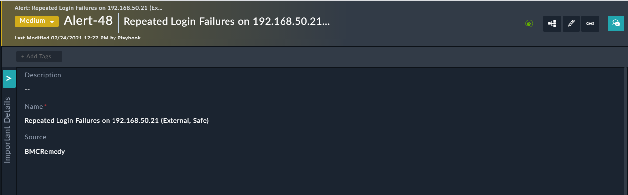
This row will appear with the expanded sidebar in the detail view as follows:
Following are some more examples of row layouts, such as a row layout with a single-column structure:

Row layout with a three-column structure:

Row layout with a left-hand side static sidebar:

Tabs
Tabs allow for the placement of multiple widgets, including rows, charts, executed playbook logs, etc. Using tabs helps you organize and categorize dashboards and present different types of information on a single page.

The following images illustrate how the Tab and Grid widgets are displayed on the module page:


Click New Tab to add a tab and enter the tab title in the Enter tab title field, and click the green checkbox. Select the Primary Tabs option to mark the tab as a primary tab, which then allows you to add a title in the Enter tab title and subtitle or description to the tabs in the Enter tab sub-title field. If a tab is not a primary tab then you can enter only the title of the tab. You can add icons to your tab titles and filter icons based on icon names as shown in the above image.
To render tabs based on specified visibility conditions, click the Settings icon. For example, if you want alerts to display the 'Audit Log' tab only if the status of the alert is set to 'High' or 'Critical', click the Settings icon on the Audit Log tab, to display the Tab Settings dialog. Select the Enable Conditional Visibility option, and then define the condition as 'Severity Equals High' or 'Severity Equals Critical' and click Save: 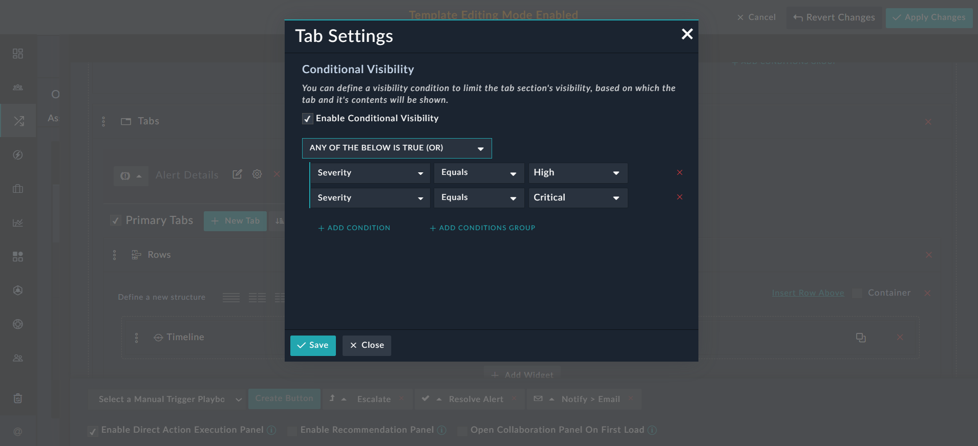
Now, the 'Audit Log' tab is visible only if the severity of the alert is high or critical:
If the severity of the alert is not high or critical, then the 'Audit Log' tab is not visible: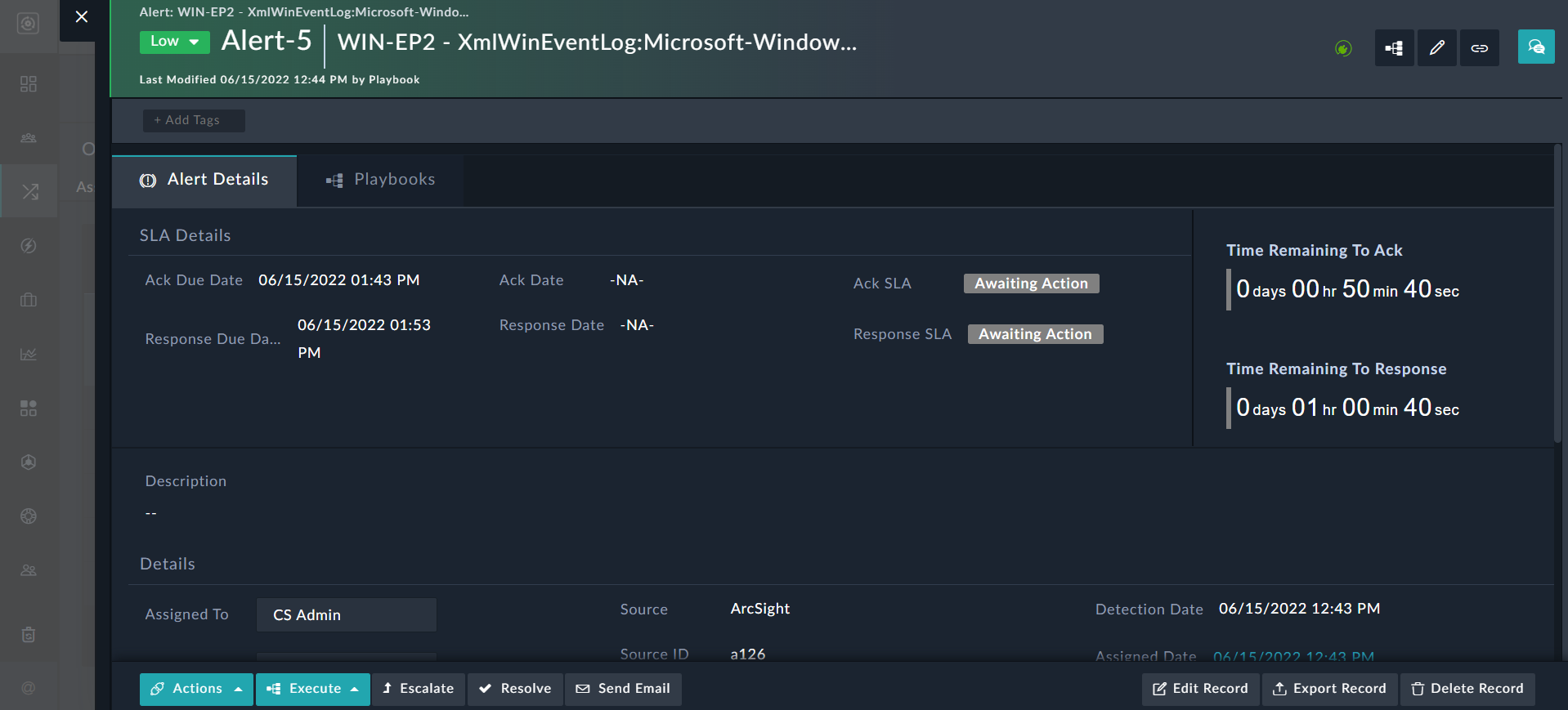
Tabs can also be rendered based on visibility conditions that are specified on relational fields. For example, if you want alerts to display the 'Tasks' tab only if the status of the task is set to 'On Hold/Blocked', click the Settings icon on the Tasks tab, to display the Tab Settings dialog. Select the Enable Conditional Visibility option, and then select Task, which is part of the Related Modules section and then define the condition as 'Severity Equals On Hold/Blocked' and click Save:
Now, the 'Task' tab is visible on alerts only when the status of the tasks linked to the alerts is set to On Hold/Blocked.
Charts and Metrics
Chart
You can represent data using different types of charts, which are Pie, Donut, Average Area, Bar, Timeseries, and Line charts. Each of these types of charts has separate data requirements.
A bar chart or bar graph is a chart or graph that presents categorical data with rectangular bars with heights or lengths proportional to the values that they represent. The bars can be plotted Vertically or Horizontally. The Bar chart widget also allows you to choose all types of fields such as lookup, or text, for both Categories and Values Axis, enabling you to be able to display data such as displaying resolved incidents per analyst.
You can select the Record Assignment (Default Filter) as Only Me or All. If you select Only Me, then from the Assignment Field drop-down list, you must select the assignment on the basis of which you want to filter the dashboard view.
You can choose to either always display the chart or to display the chart only if there is at least one record present in the selected module. This option to show/hide charts is present in the all types of chart widgets in the Section Show/Hide section, select the Always Show option (default) to always display the chart or select the Hide widget if its output has no records option to display the chart only if there is at least one record present in the selected module.
Charts leverage picklist values for discrete representations of color. If you have defined colors for the picklist values, then those values are used. Otherwise, the system automatically colors the values with a standard color palette to preserve visual continuity.

You can click on each section of the chart, for example, slices in a pie chart, and open the corresponding records in the grid view.
A Donut chart is a unique type of pie chart with an area of the center cut out. You can use the center of the Donut chart to display information inside the same, making the Donut chart more space efficient. In the case of FortiSOAR, the center area of the Donut chart displays the total number of filtered records present in the selected module or the total number of records present in the selected module (if no filter is applied). For example, if you want to display Alert records whose severity is not critical in a Donut chart, then the center of the donut chart will display the total number of alert records, which are of High, Medium, Low, or Minimal criticality, and the slices of the Donut chart will display the percentages or actual number of the alert records based on severity. If there are a total of 6 alert records, out of which 1 is critical, 2 are high, 2 are medium, and 1 is low, then the center of the donut chart will display 5 alerts, and the slices with discrete colors for severity will display percentages, e.g., 20% in orange for High alerts, 40% in yellow for Medium alerts, and 40% in green for Low alerts. You can also choose to display actual count of records instead of the percentages, by clicking the Show Actual Number checkbox in the Edit Chart dialog.
The following image illustrates how the Donut chart is displayed on the Dashboards page, both with numbers and with percentages, in the dashboard or specific page, after you have selected Assigned To in the Only Me | All (field) drop-down list:

Use the Only Me | All (field) filter, i.e., to toggle the view on dashboards or modules based on this filter, and the Nested Filters components are applicable to Card List widget.
|
|
The Only Me | All filter is not applicable to Reports, i.e., on the |
A Line chart displays quantitative values over a continuous interval or period. Use a line chart to show trends and analyze how the data has changed over time. You can group data by both picklist and non-picklist values, including integers as well as other field types (except Many to One and Many to Many) in the Y-Axis (categories) drop-down for line as well as 'Timeseries' charts.
A Timeseries chart is a line chart of repeated measurements taken over regular time intervals. In the case of the timeseries chart, time is always shown on the horizontal axis, with data points drawn at regular intervals. The timeseries charts help to show trends or patterns. You can also choose to view the 'Line' and 'Timeseries' data in a tabular format. Having the data represented in the tabular format helps you to view the varied information in one go without having to hover on the line or timeseries chart.
|
|
Records with a 'null' value in their date field, such as the 'Assigned Date' field, which is used as a parameter in the "X" or "Y" axis, are skipped and are not presented in the chart. |
To view the data of the line or timeseries chart in the tabular format, in the Edit Chart dialog, select the Show Table Data option and click Save.
The following image illustrates how the Timeseries charts are displayed on the Dashboards page when you select the 'Show Table Data' option. As you can see in the image, the data gets displayed both as a line graph and in the tabular format: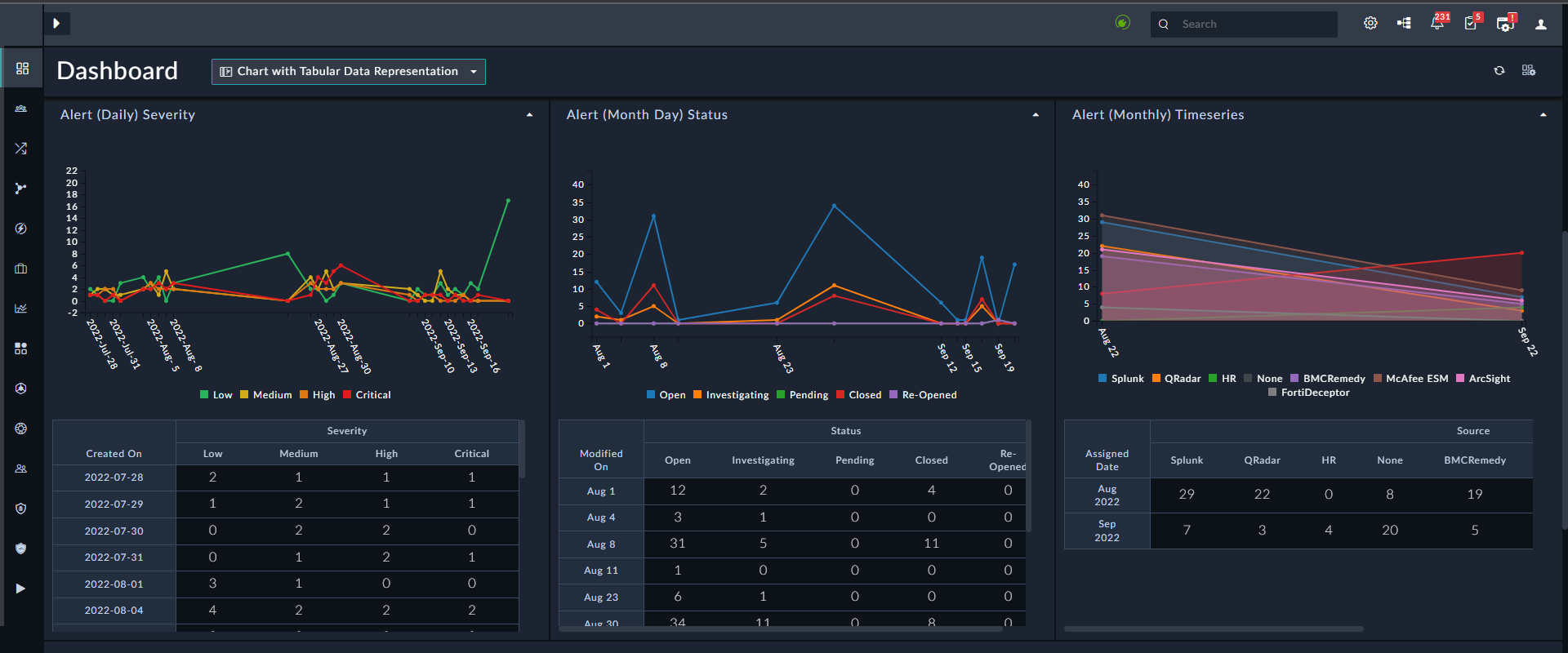
|
|
The line graph and the table displayed on a 'Dashboard' are of equal height. If there is a considerable amount of data, then the table on the 'Dashboard' appears with scroll bars. However, line graphs and the tables displayed in a 'Report' are dependent on the amount of data presented. Since 'Reports' cannot have a scroll bar, the table following the line graph displays all the content in a single view. |
Relationship Count
The Relationship Count chart is a type of bar chart that displays the count of related data records. For example, this widget can display how many indicators are related to alerts.
To configure a Relationship Count widget that will display indicators related to alerts do the following: Edit the Dashboard and select the Relationship Count widget. Add the title of the chart and select the Chart Type as Bar. Then, select Alerts as the data source in the Primary Data Source Configurations section. You can also specify a label that will be displayed on the Y axis against the primary data source, in the Custom Label field. For our example, type Alert Names.
You can select the Record Assignment (Default Filter) as Only Me or All. If you select Only Me, then from the Assignment Field drop-down list, you must select the assignment on the basis of which you want to filter the dashboard view.
In the Y-Axis (Categories) field, choose the field that you want to display on the axis of the bar chart, for example Name. Then select the related data source as Indicators in the Related Data Source Configurations section. You can also specify a label that will be displayed on the X axis against the related data source, in the Custom Label field. For our example, type Related Indicators. You can define filters for each data source, for example you can filter indicators based on the type of the indicator.

The following image displays the relationship count that displays the indicators related to alerts:

Use the Only Me | All (field) filter, i.e., to toggle the view on dashboards or modules based on this filter. The Nested Filters component is also applicable to Card List widget.
|
|
The Only Me | All filter is not applicable to Reports, i.e., on the |
Performance Metrics
Use the Performance Metrics widget to measure efficiencies that security operations gain by using automated workflows and playbooks present in FortiSOAR. The Performance widget is present in the Dashboard and Reports templates.
The following types of metrics are available in the Performance Metrics widget:
- ROI: Displays the return on investment that you gain by using FortiSOAR automation for a specified time period.
- Playbook Action Count: Displays the number of playbook steps executed for a specified time period.
- Time To X: Displays the Mean, Maximum, or Minimum Time To Restore (MTTR) or the Mean, Maximum, or Minimum Time To Detect (MTTD) taken for a particular activity. For example, you can find out the Mean Time to Resolution (MTTR) which is the difference between incident creation and incident resolution or MTTD which is incident discovery and incident creation.
- Aggregate Functions: Displays the minimum, maximum, mean, median, or sum of record fields (integer or float), for a single record or two records.
- Ratio: Displays the relationship between two values. For example, the ratio between the number of alerts escalated to incidents versus the total number of alerts created for a specified time period.
- Total Count: Displays the number of records of a specific type on which a specific action is performed for a specified number of days. For example, display the number of escalated alerts for a specified time period.
ROI
Use the ROI widget to display the return on investment or time saved by using FortiSOAR automation, based on the parameters you specify. You need to specify the following parameters:
Title: Title of the ROI widget. For example, ROI for checking IP reputation.
Show ROI Measured As: Choose between Dollar Savings or Time Savings. If you choose Dollar Savings, then you have to specify the additional parameter of $ Value Of Each Hour Of Analyst: Average cost in dollars that your organization bears for an analyst per hour. For example, 50. The remaining parameters are the same for both methods of ROI measurements.
Avg. Time For Each Manual Action: Average time, in minutes, that it takes for an analyst to execute one security investigation action. For example, to check the reputation of IP address in an online tool, such as VirusTotal. For example, 8 minutes.
Include All Playbook Executions: Select this checkbox to determine whether you want to include both the failed and successful playbook executions (this is the default). Clear this checkbox to include only successful playbook executions. This is common parameter across Performance Widgets.
Exclude Configuration Actions: Excludes playbook steps that are used for configuration and which do not add any business value, such as the trigger steps (start), the set variable step, and the steps that are waiting for a decision or approval (this is the default). Clear this checkbox to include all playbook steps. This is a common parameter across Performance Widgets.
Time Range: Specify the time, in days, for which you want to see the ROI. For example, 15 days.
Show Percentage Change: Select this checkbox to show the percentage difference in ROI value between the current ROI value and the previous ROI value for same time span (this is the default). For example, if you have chosen 4 days as the time range, then this will show the percentage difference between the ROI value for the last 4 days compared (example from the 1st to the 4th of June) with the ROI value for the 4 days before this time span (example 28th to 31st May). Clear this checkbox if you do not want to see the percentage change. This is a common parameter across Performance Widgets.

The following image illustrates how the ROI widget is displayed on the Dashboard page, if you have chosen the Dollar Savings method of ROI measurement:

Playbook Action Count
Use the Playbook Action Count widget to display the number of playbook steps executed for a specified time period. You need to specify the following parameters, apart from the common parameters of Include All Playbook Execution, Exclude Configuration Actions and Show Percentage Change:
Title: Title of the Playbook Action Count widget. For example, Automated Actions Run.
Time Range: Specify the time, in days, for which you want to see the number of playbook steps executed. For example, 5 days.

The following image illustrates how the Playbook Action Count widget is displayed on the Dashboard page:

Time To X
Use the Time To X widget to display the MTTR or MTTD for a particular activity. You need to specify the following parameters, apart from the common parameter of Show Percentage Change:
Title: Title of the Time to X widget. For example, Time to Resolve Incidents - Mean.
In this case, as an example, we are calculating the Time to X between the Resolved Date and the Discovered Date for Incidents, and we have considered the following types of Time to X, i.e., Mean, Maximum, and Minimum.
Data Source: The module on whose data you want to calculate the MTTR or MTTD. For example, Incidents.
Operation: Select whether you want to calculate the Mean, Median, Maximum, Minimum, or Sum of MTTR or MTTD time. For example, choose Mean.
For its configuration, specify Resolved Date - Discovered Date.
Filters: (Optional) Specify the filter condition, if you want to apply a filter to the records in the module you have specified.
Time Range: Specify the time, in days, and the field based on which you want to calculate the time. For example, 4 days.
Following is an example of the Time To X Mean Template configuration:

The following image illustrates how the Time To X widget - Mean is displayed on the Dashboard page:

Following is an example of the Time To X Max Template configuration:

The following image illustrates how the Time To X widget - Max is displayed on the Dashboard page:

Following is an example of the Time To X Min Template configuration:

The following image illustrates how the Time To X widget - Min is displayed on the Dashboard page:

Following is an example of the Time To X Sum Template configuration that displays the total time taken to assign incidents from the time they are created:

The following image illustrates how the Time To X - Sum widget will appear on the Dashboards page. This widget displays the total time taken to assign incidents from the time they are created:

Following image is an example of the Time To X Median Template configuration that displays the median time to resolve alerts, i.e., the median time between the time the alerts are created, and the time alerts are resolved:

The following image illustrates how the Time To X - Median widget will appear on the Dashboards page. This widget displays the median time between the time incidents are discovered and the time incidents are resolved:

The "Time To X" widget also supports the following:
- Displaying MTTR values as a Bar Chart, both horizontal and vertical. Earlier this widget could only be displayed using the "Card View".
- Displaying categories within the MTTR view. For example, displaying the time to resolve alerts of different levels of severity by a specific user.
Following is an example of how to create a MTTR dashboard using a Bar Chart that displays the mean time taken for a particular user to resolve alerts of varying severity.
Title: Title of the Time to X widget. For example, Mean time to resolve alerts by user and severity.
Data Source: The module on whose data you want to calculate the MTTR. For example, Alerts.
Layout: Choose the layout of the widget. You can choose between Card View or Bar Chart. For our example, choose Bar Chart.
If you choose Bar Chart, then in the Chart Type choose between Horizontal or Vertical. For our example, choose Horizontal.
X-Axis Grouping - 1st Level: Select the field based on which you want to group the records to be displayed in the dashboard. This will form the primary filter for displaying the dashboard. For our example, we require to display the mean time taken by a specific user, for example, csadmin, to resolve alerts of varing severity levels. Therefore, for the primary filter, select Assigned To.
X-Axis Grouping - 2nd Level: Select the field based on which you want to further group the records to be displayed in the dashboard. This will form the second filter for displaying the dashboard. For our example, select Severity.
We choose Assigned to and Severity as the primary and secondary filter respectively since we want the MTTR dashboard to display the time taken for resolving alerts grouped the user and severity.
Operation: Select whether you want to calculate the Mean, Median, Maximum, Minimum, or Sum of MTTR or MTTD time. For our example, choose Mean.
For its configuration, specify Resolved Date - Assigned Date.
Filters: (Optional) Specify the filter condition, if you want to apply a filter to the records in the module you have specified.
In this you can specify the filter Assigned To Equals CS Admin, since we want to display how much time the csadmin user takes to resolve alerts of varying severity levels.
Time Range: Specify the time, in days, and the field based on which you want to calculate the time. For example, Resolved Date is in the 6 Days.
Following image is an example of the MTTR Dashboard configuration that displays the mean time to resolve different types of alerts, i.e., the mean time between the time the alerts are assigned, and the time alerts are resolved:

The following image illustrates how the MTTR Dashboard that displays a bar chart showing the mean time to resolve alerts by type on the Dashboard page:

Aggregate Functions
Use the Aggregate Functions widget to calculate and display the minimum, maximum, median, mean, or sum of record fields (integer/decimal), for a single record or for two records. You need to specify the following parameters, apart from the common parameter of Show Percentage Change:
Title: Title of the Aggregate Functions widget. For example, Average time in mins to contain incidents.
Data Source: The module on whose data you want to calculate the minimum, maximum, average, or sum of integer or float fields. For our example, select Incidents.
Operation: Select the operation, which is MEAN that you want to perform on the fields and for this operation and then select Single Record Field.
Configuration: In the configuration section, select the field on which you want to perform the operation. The fields must be of type Integer or Decimal. For our example, select Containment Time (minutes).
|
|
It is recommended that when you create an Integer field, you should set its default value as "zero" in the module editor. Since if any column specified in the configuration has NULL values, then the Aggregate Functions might not show the correct value in the dashboards. |
Filters: (Optional) Specify the filter condition, if you want to apply a filter to the records in the module you have specified.
Time Range: Specify the time, in days, and the field based on which you want to calculate the time. For our example, we want to see results of incidents created in the last 4 days.
The following image is an example of the Aggregate Functions widget that has configured according to the above specifications:

The following image illustrates how the Aggregate Functions widget will appear on the Dashboards page. This widget displays the average time, in minutes that it takes to contain incidents, in the last 5 days:

Similarly, you can find out maximum, minimum, median, and sum for integer or decimal fields.
You can also perform an operation that works on two fields and get their maximum, minimum, mean, median, or sum of the difference or aggregation of these fields.
For example, the average difference between the containment time and the recovery time for incidents. The following image is an example of the Aggregate Functions widget configured for this example:

The following image illustrates how the Aggregate Functions widget will appear on the Dashboards page. This widget displays the average time, in minutes, to recover after containing incidents, in the last 5 days:

Ratio
Use the Ratio widget to display the relationship between two values. You need to specify the following parameters:
Title: Title of the Ratio widget. For example, Created Alerts v/s Escalated Alerts.
Data Source: The module on whose data you want to calculate the ratio. In the case of the Ratio widget, you must specify two data sources since you require to compare two values. For our example, select Alerts as both the data sources.
Filters: (Optional) Specify the filter condition, if you want to apply a filter to the records in the module you have specified. For our example, in one option you do not require to apply any filter since we are comparing all the alerts created and in the other option specify a filter such as Escalated Equals Yes.
Time Range: Specify the time, in days, and the field based on which you want to calculate the time. For example, 3 days.

The following image illustrates how the Ratio widget is displayed on the Dashboard page:

Total Count
Use the Total Count widget to display the number of records of a specific type on which a specific action is performed for a specified number of days. You need to specify the following parameters, apart from the common parameter of Show Percentage Change:
Title: Title of the Total Count widget. For example, Alerts Resolved.
Data Source: The module on whose data you want to calculate the total count. For example, Alerts.
Filters: (Optional) Specify the filter condition, if you want to apply a filter to the records in the module you have specified. For example, since we want to get the total count of escalated alerts, specify a filter such as Status Equals Closed.
Time Range: Specify the time, in days, and the field based on which you want to calculate the time. For example, 2 days.

The following image illustrates how the Total Count widget is displayed on the Dashboard page:

System Monitoring
Use the "System Health Status" Dashboard that is included by default in FortiSOAR to monitor various FortiSOAR system resources such as CPU, Disk Space and memory utilization, and the statuses of various FortiSOAR services. The advantage of having the System Health Status Dashboard is that now you do not require to log into the FortiSOAR server to check the various usage levels and you can also define various thresholds for each system resource and if these thresholds are breached then you can take some corrective actions.
From version 6.4.3 onwards, you should set up system monitoring for FortiSOAR, both in case of a single node system and High Availability (HA) clusters on the System Configuration page. To know more about the setting up thresholds and enabling notifications, to effectively monitor various FortiSOAR system resources, see the System Configuration chapter in the "Administration Guide."
For versions prior to 6.4.3, you should set up thresholds, schedules, and notifications for the System Monitoring playbook that is included by default with FortiSOAR to effectively monitor various FortiSOAR system resources. To know more about configuring thresholds, schedules, and notifications, see the System Monitoring: Setting up thresholds, schedules, and notifications article present in the Fortinet Knowledge Base.
The following types of system monitoring are available in the System Monitoring widget:
- CPU Usage: Displays the percentage (%) of overall CPU utilization.
- Virtual Memory Usage: Displays the percentage (%) of overall Virtual Memory utilization.
- Swap Memory Usage: Displays the percentage (%) of overall Swap Memory utilization.
- Disk Space Usage: Displays the percentage (%) of disk space consumption for different partitions.
- Service Status: Displays the status for all FortiSOAR services.
- Playbook Execution Monitoring: Displays details of queued and executed workflows, and also the percentage of workflows disk space that can be reclaimed.
Following is an image of a sample System Health Status Dashboard:

Utilization widgets
Use the Utilization widgets to display the utilization of various FortiSOAR system resources. Utilization widgets are: CPU Utilization, Disk Space Utilization, and Memory Utilization. These widgets can be configured in a similar manner and are used to display the utilization of various FortiSOAR system resources.
Title: Title of the Utilization widget. For example, if you are selecting the CPU Utilization widget, you can name this widget as CPU usage.
Choose Type of System Monitoring: For utilization, you can choose from, CPU Utilization, Disk Space Utilization, or Memory Utilization.
Threshold Percentage: Specify the percentage after which you want to take some corrective action. On the dashboard, the widgets will visually indicate when the threshold is reached or exceeded, in the red color. Similarly, it will display various colors, green, yellow, amber according to threshold value.
Following is a sample image of a configured CPU Utilization widget:

Service Status widget
This widget displays the status for all FortiSOAR services. Services that are available are displayed with a green circle. If any service is down, then that service will be displayed with a red warning symbol, as is the case with the postgresql-14 service in the following image:

The cyops-integrations-agent service is also monitored. The cyops-integrations-agent service supports running actions on remote FSR agents.
Title: Title of the Service Status widget. For example, Services status.
Choose Type of System Monitoring: Select Service Status.
Playbook Execution Monitoring widget
Use the Playbook Execution Monitoring widget to display details of queued and executed workflows, and also the percentage of workflows disk space that is marked for clean-up.
Title: Title of the Playbook Execution Monitoring widget. For example, Monitoring Playbook Executions. From the Choose Type of System Monitoring drop-down list, choose Playbook Execution Monitoring.
To view the currently queued workflow, select the Show Current Playbook Queue Load option.
To view the total executed workflows, select the Show Current Playbook Execution Log Size option
To view the percentage of workflows disk space that is marked for cleanup, and which can be reclaimed, select the Show Eligible Database Size To Be Reclaimed option:
Following is a sample image of a configured 'Playbook Execution Monitoring' widget:
Connector Health
Use this widget to track the health of all the configurations of all your configured connectors. Some system connectors such as BPMN, Report Engine, Utilities, etc. do not require any configuration, therefore this widget does not display the health of these connectors.
|
|
The Connector Health widget displays only those configurations that has access to both 'Self' and 'Agent'. For more information on connectors and their configurations, see the "Connectors Guide." |
You can edit only the Title of this connector.

The following image illustrates how the Connector Health widget is displayed on the dashboard page:

Each connector configuration row will display the number of configurations that are being monitored, for example, in the image above, all the connectors have 1 Configuration Monitored.
If any of the configurations of a connector is unavailable, then the widget will display "Unavailable" in the red color and the Health Check will be Unavailable. For example, in the above image the configuration of the Anomali ThreatStream connector is unavailable. To view the details of the configuration being unavailable, click the down arrow on the connector row, to display the Health Check Status of that configuration. You will see that the Health Check Status of this configuration is "Disconnected". You can hover on the warning icon to know the reason for the configuration being disconnected.
If all the configurations of the connector are available, then the widget will display "All Available" in green color and the Health Check will be "Available". If any configuration is unavailable, then the widget will display "1 Unavailable" in the red color and when you click the down arrow the Health Check Status will display "Available" for the configurations that are available, and display "Disconnected" for the configuration that is unavailable.
If any connector is deactivated, then it will appear as "Deactivated" in red color and the Health Check will display as "Deactivated".
Record - Card View
Card Lists
Cards are like Single Line widgets, but they are in the form of card list in which you have up to four fields in a row. Using the Card left border Color Based On drop-down list, you can also choose a color to emphasize fields, such as Type, Severity, or Status.
You can select the Record Assignment (Default Filter) as Only Me or All. If you select Only Me, then from the Assignment Field drop-down list, you must select the assignment on the basis of which you want to filter the dashboard view.

The following image illustrates how the Card List widget is displayed on the module page:

Use the Only Me | All (field) filter, i.e., to toggle the view on dashboards or modules based on this filter. The Nested Filters component is also applicable to the Card List widget.
|
|
The Only Me | All filter is not applicable to Reports, i.e., on the |
Card Count
The Card Count widget is simpler forms of the card widget showing a single number representing the total sum of a field on a data model based on the filter you have specified. For example, using the Group By field, in the Card Count widget you can get the total count of records assigned to with specific levels of severity. You can select the maximum number of records to be fetched, up to the maximum of 250 records (default is set to 10) from the Max Record Limit drop-down list, so that the widget displays the total count of those many records based on the specified filter.
You can select the Record Assignment (Default Filter) as Only Me or All. If you select Only Me, then from the Assignment Field drop-down list, you must select the assignment on the basis of which you want to filter the dashboard view.

The following image illustrates how the Card Count widget is displayed on a page: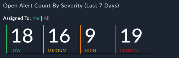
Use the Only Me | All (field) filter, i.e., to toggle the view on dashboards or modules based on this filter. The Nested Filters component is also applicable to Card Count widget.
|
|
The Only Me | All filter is not applicable to Reports, i.e., on the |
Record - Listing
From release 7.2.0 onwards, you can change the listing page title if you want to name it something other than the plural name of the module. You can change listing page title of modules in Incident Response (Indicators, Tasks, etc.) and Resources (Attachments, etc). However, you cannot change the title of modules in Automation, except the SLA Templates module, or modules such as Reporting, Content Hub, Queue and Shift Management, etc.
For example, if you want to change the name of the Alerts module on the Alerts Listing page to Custom Alerts, click Alerts from the left-navigation to view the alert records listing page. Click the Edit icon on the top left of the Alerts page, to enter the 'Template Editing' mode. In the Template Title field, enter the name of the module that you want to display as the title of the list view. For example, enter Custom Alerts: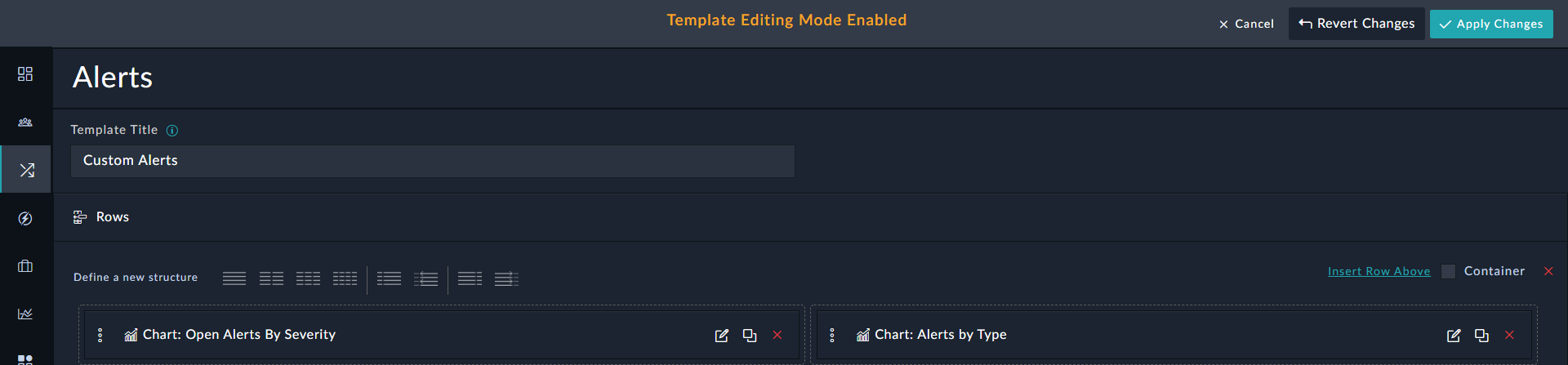
Click Apply Change and then click Confirm to view the updated list view title:
To change the title back to its original, edit the template and clear the text of the Template Title field.
Single Line Item
The Single Line widget displays records in a single column. You can use this widget to display records, such as tasks, that are assigned to you and get the complete detail of the tasks in one view.
You can select the Record Assignment (Default Filter) as Only Me or All. If you select Only Me, then from the Assignment Field drop-down list, you must select the assignment on the basis of which you want to filter the dashboard view.

The following image illustrates how the Single Line Item widget is displayed on the module page:

Use the Only Me | All (field) filter, i.e., to toggle the view on dashboards or modules based on this filter. The Nested Filters component is also applicable to Card List widget.
|
|
The Only Me | All filter is not applicable to Reports, i.e., on the |
Simple Grid
Use the Simple Grid widget to render data in a tabular form in dashboards and reports or wherever you want to render data in the grid format. The Simple Grid widget does not provide any option to search or sort columns or apply filters to records in the List View of the module (as available in the Module List View using the Grid widget). The Simple Grid is a pure display-only grid that gets sorted as per the template specification.
When you are adding or editing the Simple Grid widget in Dashboards or Reports, you must specify the title of the simple grid and the Data Source which will determine the record type that the simple grid will contain. For example, if you select the Data Source as Alerts, then the widget displays only those records whose type is "Alerts."

In the Section Show/Hide section, you can choose to either always display this widget, the Always Show option (default), or you can choose to display this widget only if there is at least one record present in the selected module, the Hide widget if its output has no records option.
In the Maximum Record Limit field specify the maximum number of records that should be displayed in the widget. You can specify any number between 1 to 200. By default, it is set to 10.
In the Columns section, select the columns that will be displayed as part of the grid in the List view of the module. To add the field as a column, select the field to be part of the grid from the Select a Field list and then click Add Column. If you want to define the width of the columns in the grid, then select the Configure Grid Column Width check box, and this will display a text box in the columns which you have added in which you can specify the width of the columns in the percentage (%) format. You can also change the position of how the columns will be displayed in the grid by dragging and dropping the field, add filters to the grid and sort the grid based on a sorting parameter you specify.
From version 6.4.3 onwards, the Simple Grid widget displays the complete text instead of "..." for fields that could contain longer content such as "Description". This enhancement ensures that reports do not contain truncated field content and instead contain the complete content for all fields.
For more information on adding filters and sorting records, see Common components within Widgets.
The following image illustrates how the Simple Grid widget is displayed when used in a dashboard or specific page:

As you can see in the above image, using the Simple Grid you cannot perform any operations, like sorting columns or filtering records, it is only used to display data in the grid format.
Grid
Grids are tables, with rows representing record instances and columns representing fields.
From release 7.2.0 onwards, you can choose to use a lighter version of the grid widget for better performance and usability. To use the lighter version of the grid widget, click the Enable Light Mode checkbox in the Grid row:
The performance improvements in the case of the Light Mode are achieved by fetching the total count of records only on demand when the user clicks Get Total Item Count at the top of the grid. Also, in this case, the pagination options at the bottom of the grid display the Next and Previous buttons without the total count of pages as shown in the following image:
|
|
In the case of the Light Mode Grid, users can navigate beyond the last page when the page length and number of records on the last page are equal. For example, the page length is set to 20 records per page and there are 40 records in all, then users can navigate to the 3rd page, where they will see 0 records. However, if there are 30 records in all then this issue will not occur, i.e., the users will be able to navigate only till the 2nd page. |
Performance tests run to ascertain the performance improvements achieved while using the Grid in the Light Mode when compared to the normal Grid determined that using the Grid in the Light Mode improved the performance by around 35%. Some numbers that we observed while running is the test are:
- For pages containing 30 records per page, a performance improvement of 65% was observed.
- For pages containing 250 records per page, a performance improvement of 17% was observed.
To edit a grid, click the Edit icon in the Grid Widget row. A grid holds records belonging to a single record type based "Data Source" that you have specified. For example, if you select the Data Source as Alerts, then the widget displays only those records whose type is "Alerts."

|
|
It is recommended that you should use the Simple Grid widget and not use the Grid widget to create Reports. |
If you want to allow horizontal scrolling in grid views, which provides better usability in scenarios where the data grids that have a large number of columns, then select the Enable Horizontal Scroll checkbox. If after enabling the horizontal scroll, you decide that you do not want a horizontal scroll, i.e., you clear the Enable Horizontal Scroll checkbox, then all the columns of the grid will go back to having equal width.
If you want to display an overview of record in the grid view itself instead of the user having to open the record in the detail view, then select the Enable Row Expansion checkbox. From the Select a field list, select the fields that will be displayed as part of the record overview when the user clicks the expand icon (>) in the record row. From version 7.2.0 onwards, you can also choose to edit the fields that are part of the expanded row by selecting the Make Fields Editable checkbox. This is useful in cases such as, analysts working in the preview mode itself can quickly select the appropriate closure reason for an alert and add the closure notes to the alert. You can also choose how to render a text field that has its subtype set to "Rich Text", either Rich Text (Markdown), which is the default or Rich Text (HTML). For example, in the following image, you can choose how you want to render the "Description" field, from the following options: Markdown (default), iFrame, or iFrame (Sandbox) by clicking its Settings ( ) icon:

Similarly, if you have a text field that has its subtype set to "Rich Text (HTML)", you can choose how you want to render that field from the following options: HTML (default), iFrame, or iFrame (Sandbox), and if you have a text field that has its subtype set to "Text Area", you can choose to display it in the JSON format.
The following image illustrates how a record with its row expanded is displayed in the Grid view:

In the Grid widget in Reports and Dashboards, you will find an additional Limit field, in which you can specify the number of records that will be displayed on a single page for that module. By default, this is set to 30.
In the Columns section, select the columns that will be displayed as part of the grid in the List view of the module. To add the field as a column, select the field to be part of the grid from the Select a Field list and then click Add Column. You can add tags, which are very useful in locating records, to records by choosing the Tags field. You can add special characters and spaces in tags from version 6.4.0 onwards. However, the following special characters are not supported in tags: ', , , ", #, ?, and /. Once you add the Tags column, you can add and search for tags while adding or editing records. You can also change the position of how the columns will be displayed in the grid by dragging and dropping the field to the appropriate place on the grid as shown in the following image:

In the Actions section, you can create buttons for commonly used actions by selecting a manual trigger playbook from the Select a Manual Trigger Playbook list and click Create Button. You can search and select an icon that that will be displayed on the action button from the Filter Icons list. If you do not want an icon to be displayed, select None. The names that are displayed in the Select a Manual Trigger Playbook drop-down list, and therefore the name of the manual trigger button, are the names that you have specified in the Trigger Label Button field in the playbook.

You can also define filters for records in the Grid widget itself. The Grid Widget includes the Nested Filters component that you can use to filter records in the list view using a complex set of conditions, including the OR condition. See the Nested Filters section for more information.
The following image includes a specific filter criterion for filtering records that have Severity Equal to Critical OR Status Equal to Investigating:

You can also use Default Sort to specify fields based on which the records in the module will be sorted by default.
Once you have made all the changes to the Grid widget, click Save and Apply Changes to view the updates made to the List View in the module.
The following image displays the List view of the module, with a record being expanded, in which the Severity Equal to Critical OR Status Equal to Investigating filter has been applied:

Summary
Use the summary widget to display multiple editable fields that you can display in the record detail header, with an aim to summarize the record quickly.
When you are adding or editing the Summary widget in Dashboards and Reports, you must specify the Data Source for which you want to add the summary, and then select and add fields that you want to include as part of the summary, as shown in the following image:

In the Section Show/Hide section, you can choose to either always display this widget in the dashboard or report, the Always Show option (default), or you can choose to display this widget only if there is at least one record present in the selected module, the Hide widget if its output has no records option.
In the Max Record Limit drop-down list, you can also specify the maximum number of records you want to see in the summary widget, by default, it is set to 10.
From version 7.0.2 onwards, you can choose to add a page break after each iteration of the Summary widget by clicking the Print each record on new page checkbox. If you select this checkbox, then for example, if you have configured your Summary widget to display critical alerts with their related incidents, then the summary of each critical alert along with its associated incidents get displayed in a new page. If you do not select the checkbox, then the critical alerts and their associated incidents are displayed one after the other without any page breaks.
The Record Title section contains the Richtext Content widget, using which you can define a stylized title for each looping section within the Summary widget. See the Richtext Content section for more information.
You can choose whether you want to view the Summary in the Card View or the Grid View.
From the Select a Field drop-down list, select the fields that you want to be part of the Summary and click Add.
In the Related Records section, you can add the widgets of the linked records belonging to the selected record, i.e., you can add related widgets that you require within the Summary widget. For example, if you want to display an incident summary along with all its linked alerts, in a single Dashboard or Report, you can use the Summary widget and in the Related Widgets section, you can add a chart widget that displays linked alerts:

The following image illustrates how the Summary widget that you have defined above will appear in a Dashboard or a report:

In case of the Detail view, since you are already in a module, you do not need to specify the module. All you need to do is select and add fields that you want to include as part of the summary, as shown in the following image:

Record Fields
Editable Form and Editable Form Group
Form Group widgets display records as part of an editable form. There are the following types of form widgets:
Editable Form widget: Use this widget to insert a form that contains all the editable fields for the Alerts module. You cannot choose fields in this widget and all the editable fields of the current module are included.

The following image illustrates how the Editable Form widget is displayed in the Detail View of a record:

Editable Form Group widget: Use this widget to insert a group of standalone form fields. You can use this widget to create a form that users can use to fill in the details for a record:

The following image illustrates how the Editable Form Group widget is displayed in the Detail View of a record:

If you have a text field that has its sub-type set to "Rich Text (Markdown)" such as the "Description" field, you can choose how you want to render that field from the following options: Markdown (default), iFrame, or iFrame (Sandbox):

Similarly, if you have a text field that has its sub-type set to "Rich Text (HTML)", you can choose how you want to render that field from the following options: HTML (default), iFrame, or iFrame (Sandbox), and if you have a text field that has its subtype set to "Text Area", you can choose to display it in the JSON format (See Displaying "Text Area" fields in the JSON format).
Important: When the sub-type of a field is set as Rich Text (HTML) or Rich Text (Markdown), and this field expects data to be populated from external data sources using data or email ingestion, then ensure that the System View Template (SVT) of the field is set to 'iFrame', i.e., select iFrame as the HTML View Mode of this field to prevent any XSS attack attempts or overriding of the parent CSS styling.
Uncategorized Fields
Use the Uncategorized Fields widget to display fields that have been newly added or the ones that have not been explicitly added to the module layout or view template. This widget evaluates missing fields by comparing the fields in the module mmd with existing fields added in the view panel (module layout) of that module. Similarly, whenever you add any new fields to a module, those also will be displayed in this widget and you can choose to display those fields in the view panel.
For example, if you select the Incident Module and add the Uncategorized Fields widget, you will see the fields that are present in the module but not added in the view panel, which are Source Data, Impact Assessments, System Assigned Queue, Created By, and Tags. The missing fields are shown in the Excluded Fields section. To choose the fields that you want to display in the view panel, click the red cross in the row of those fields. These fields will move to the Included Fields section and will be shown in the view panel. For example, if you do not want to include the Source Data, Tags, and Created By fields in the view panel, then click the red cross in that row in the Excluded Fields section, which will then move these fields into the Included Fields section, as shown in the following image:

The following image illustrates how the Uncategorized Fields widget is displayed in the Detail View of a record:

Summary
Use the summary widget to display multiple editable fields that you can display in the record detail header, with an aim to summarize the record quickly. For more information, see the Summary section above.
Header Widgets
Primary Detail
Use the Primary Detail widget to add a Header row that is a top-most field to display a record title. You can choose whether this field would be editable or not. If you do not want the Header row items to be editable, then click the Read-Only checkbox for the Picklist and Title Field fields. If you want any URLs in the Header row to be clickable, then click the Clickable Links checkbox.
You can choose the ID field that will be displayed in the Primary Details row in the Detail View of a record. The ID field that you can choose is limited to integer fields or text fields. For example, you can choose Source as the ID Field to be displayed in the Detail View of a record. By default, the system ID is selected in the ID Field drop-down list.
From version 7.0.0 onwards, a new Featured Relationship widget is added to the Primary Detail widget. This widget displays a single related record, which is usually utilized to show any active war room or other investigation. To configure this widget, use the Select a field drop-down to select the relationship field you want to display in this record. For example, select War Rooms. In the Color Field choose the field which will be used to display the color of the indicator circle. In the Pre-text field, enter the text that should appear before the record ID. To drill down on the specific record that will be displayed, specify the query filters and sort order. For example, in case of war rooms, this widget gets displayed only if the "War Room status is set to Live" and it uses the most recent War Room since the sort is set to Created On (descending order).

This widget adds a row that has a large font-size and no field label. You will also see + Add Tags field in this row using which you can add tags to the record making it easier for searching and filtering records.
The following image illustrates how the Primary Detail widget is displayed in the Detail View of a record if you have selected Source as the ID Field, and the incident is part of War Room-1:

The following image illustrates how the Primary Detail widget is displayed in the Detail View of a record if ID is retained as the ID Field, and the incident is part of War Room-1:

Record Type
Use the Record Type to add a stylized field in the top left of the record to display the fields such as severity, status, type, etc of the record.

The following image illustrates how the Record type widget is displayed in the Detail View of a record, when Type is selected to be displayed:

Related Record Listing
Relationships
The Relationships widget displays relationships between the current module and other modules. For example, if the current alert row has a corresponding indicator, then that indicator is displayed as a row, using this widget.
You can select the relationships that you want to include or exclude from the view, i.e. in the Relationships tab of the current module. By default, Exclude Few, Include Rest option is selected, i.e., by default, a few modules of your choice are excluded from the view, and all the remaining modules, both current (existing modules) and future (modules that you might add in the future) are included in the view:
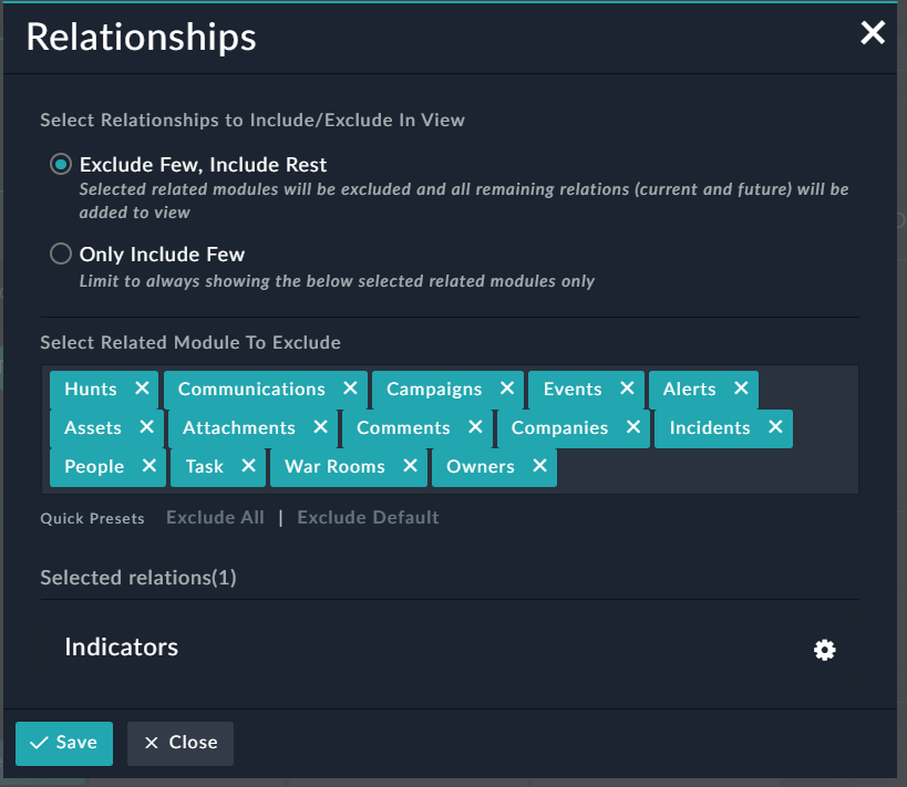
The other option is Only Include Few, which limits modules displayed in the view to only those that you explicitly select in the Selected Relation Modules To Include list. Therefore, in this case newly added modules do not get included in the view.
The Selected Related Module To Exclude lists the modules that will be excluded from view, you can choose to add more modules to this list or remove some modules from this list. You can also use the options present in the Quick Presets section to quickly exclude modules to display in the view. Click Exclude All to exclude all the modules from the Relationships tab of the current module, or click Exclude Default to exclude default modules, i.e., Comments and Attachments from the Relationships tab of the current module.
Similarly, if you choose Only Include Few, then from options in the Quick Presets section choose to quickly include modules to display in the view. Click Include All to include all the modules from the Relationships tab of the current module, or click Include All (Skip Default) to include all modules except the default modules, i.e., Comments and Attachments in the Relationships tab of the current module.
You can now set up how the relationships are displayed in the current record by clicking the Settings () icon in the row of the relationship you want to edit, for example, in the Indicator row:

You can set up the following:
- Enable Light Mode: Select this option to use a lighter version of this widget for better performance and usability.
- Enable Horizontal Scrolling: Select this option to allow a horizontal scroll in the case of a large number of columns
- Enable Row Expansion: Select this option to view details of related records in the grid view of the relationship widget itself, instead of having to open the related record in a new window to view its details. Select the Enable Row Expansion checkbox and from the Select a field list, select the fields that will be displayed as part of the record overview when the user clicks the expand icon (>) in the record row.
You can also choose how to render a text field that has its subtype set to Rich Text (Markdown), which is the default, or Rich Text (HTML). For example, in the above image, the "Description field" is subtype is set to Rich Text (Markdown; therefore, you can choose how you want to render the "Description" field, from the following options: Markdown (default), iFrame, or iFrame (Sandbox). Similarly, if you have a text field that has its subtype set to "Rich Text (HTML)", you can choose how you want to render that field from the following options: HTML (default), iFrame, or iFrame (Sandbox), and if you have a text field that has its subtype set to "Text Area", you can choose to display it in the JSON format.
Once you are done with your changes, click Save.
The following image illustrates how the Relationships widget is displayed in the Indicator tab of the detail view of an alert record:

Relationships Single Line Card
The Relationships Single Line Card widget like the Relationship widget displays relationships between the current module and other modules. However, it displays the related records in a single row and column. You can define the fields that you would like to see for the related record in a single view.
Version 7.0.0 enhances this widget to make it more intuitive and represent relationships in a user-friendly way. You can now link new records from the rendered widget, and also display more fields using this widget with greater control over the layout of the fields.
You can select fields from the Select a field drop-down list, and choose which block you want to display that field. To add a field in block one, select the field, and select the Add in block 1 checkbox, and then click Add Column. Each field in Block 1 gets displayed in their own row. To add a field to Block 2, ensure that the Add in block 1 checkbox is cleared (default). Fields in block 2 get grouped.
For example, in the following image, the Relationships Single Line widget has been defined for alerts with corresponding incidents. Also, the Name and Severity fields have been added to Block 1, and Status, Phase, and Incident Lead field have been added to Block 2:

The following image illustrates how the Relationships Single Line Card widget is displayed in the Detail View of an alert record that has a related incident record:

As seen in the above image, the Name and Severity fields have their individual rows, and the Status, Phase, and Incident Lead fields have been grouped in a single row. Also, you can click the Link Record icon to link new records from the widget.
Utility Widgets
Comments
Comments are a unique record type that can be associated with any other record and displayed within the record detail interface. You can place the Comments widget anywhere within a record and comments are added in a rich text format, using formatting styles. You can also embed hyperlinks and media within comments.
|
|
Clicking the Compact option hides the rich text controls. |

The widget displays the chronological history of all comments on that record. Comments, whether they are added using the comments widget or the collaboration panel, are automatically displayed in the Timeline (Audit Log) of any record.
From version 6.4.3 onwards, you can edit the Contents field in the "Comments" module, and choose how this field should be rendered, either Rich Text (Markdown), which is the default or as Rich Text (HTML). The following image illustrates how the Comments widget is displayed in the Detail View of a record, when the "Content" field is set as Rich Text (HTML):

The following image illustrates how the Comments widget is displayed in the Detail View of a record, when the "Content" field is retained as Rich Text (Markdown):

You can format, add links, and inline images to your comment using the "Styling" toolbar. You can add files or images by dragging-and-dropping files or images (these are added as inline images) onto the comments panel, or by clicking the Attachments button. You can attach a maximum of five files to a single comment. Both Inline images and images that are attached get appropriately resized within comments. To view the images as per its original size so that it becomes possible to read the contents of the images, click the attachment name to see the enlarged image. In case of inline images, clicking the image name downloads the original image.
Click the Inline code or codeBlock buttons to add code to the comment. You can preview the comment by clicking on the Preview tab and click the Full Screen icon to make the workspace cover the complete screen.
To add tags associated with this comment, add the tag in the + Add Tags field. You can search for comments in the search using the Search textbox and also filter comments using tags. You can delete or modify your comments based on the settings assigned by your administrator.
Version 7.0.0 introduces some important enhancements to the comments widget such as:
- Support for message threads (or nested replies), which helps to keep track of conversations and makes it easier to respond to a specific thread.
- Ability to mark a comment as important.
- Added support for adding mentions or tagging users in comments by typing
@, and then selecting the users from the displayed list. - Added support for filtering comments based on tags, mentions, and the importance flag.
For details on these enhancements, see the Working with Modules - Alerts & Incidents chapter.
|
|
If you select the Press "Enter" to post option, then comments get posted immediately after the user presses |
Visual Correlation
Use the Visual Correlation widget to visually display the nodes related to a particular record, i.e., to view the visual relationship in a graph format.
If you are adding Visual Correlation as a tab, then click New Tab and enter the name of the tab, for example, Visual Correlation, select an icon associated with this tab, and then click the green check mark. Click Add Widget in this tab and then select Visual Correlation in the Choose Widget dialog to add the visual correlation widget in the detail view of the record. You can edit this widget to add a title to the Visual Correlation graph, by clicking the Edit icon in the widget's row, and enter the title in the Visual Correlation Widget Title field, for example, Alerts: Correlated Records. From version 6.4.0 onwards, you can define the levels at which various nodes will be displayed in the "Tree" view of the graph. You can change the levels by dragging and dropping the nodes at the level you want to display the nodes in the "Tree" view of the graph. Click Save to save the changes to the Visual Correlations widget.

As shown in the above image, we have set Alerts as Node Level 1, Incidents as Node Level 2 and so on.
Your administrator must configure settings for the correlations for this widget to be displayed in the detail view of the record. For more information, see the Application Editor chapter in the "Administration Guide."
If the correlations settings are done, then you can see the Visual Correlation widget in the detail view of an "Alert" record as shown in the images in the following list.
The Correlations Graph also includes the following:
- A legend that describes the node types of the related records to left of the Correlations Graph.
- The ability to fit the graph on the screen by clicking the Fit in view button and other usability enhancements such as zoom and pan tools.
- The ability to toggle between the Tree view and the Hub and Spoke view. The "Tree" view, which is the default view displays the nodes in a hierarchical manner. The hierarchy in which the nodes are displayed is defined when you add the Visual Correlation widget.
In our case we have defined "Alerts" as Node Level 1, "Incidents" as Node Level 2, "Tasks" as Node Level 3, "Indicators" as Node Level 4, and so on, as shown in the following image: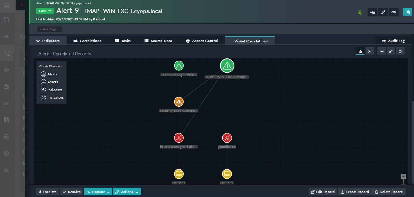
The "Hub and Spoke" mode displays the nodes in a circular network graph format, as shown in the following image: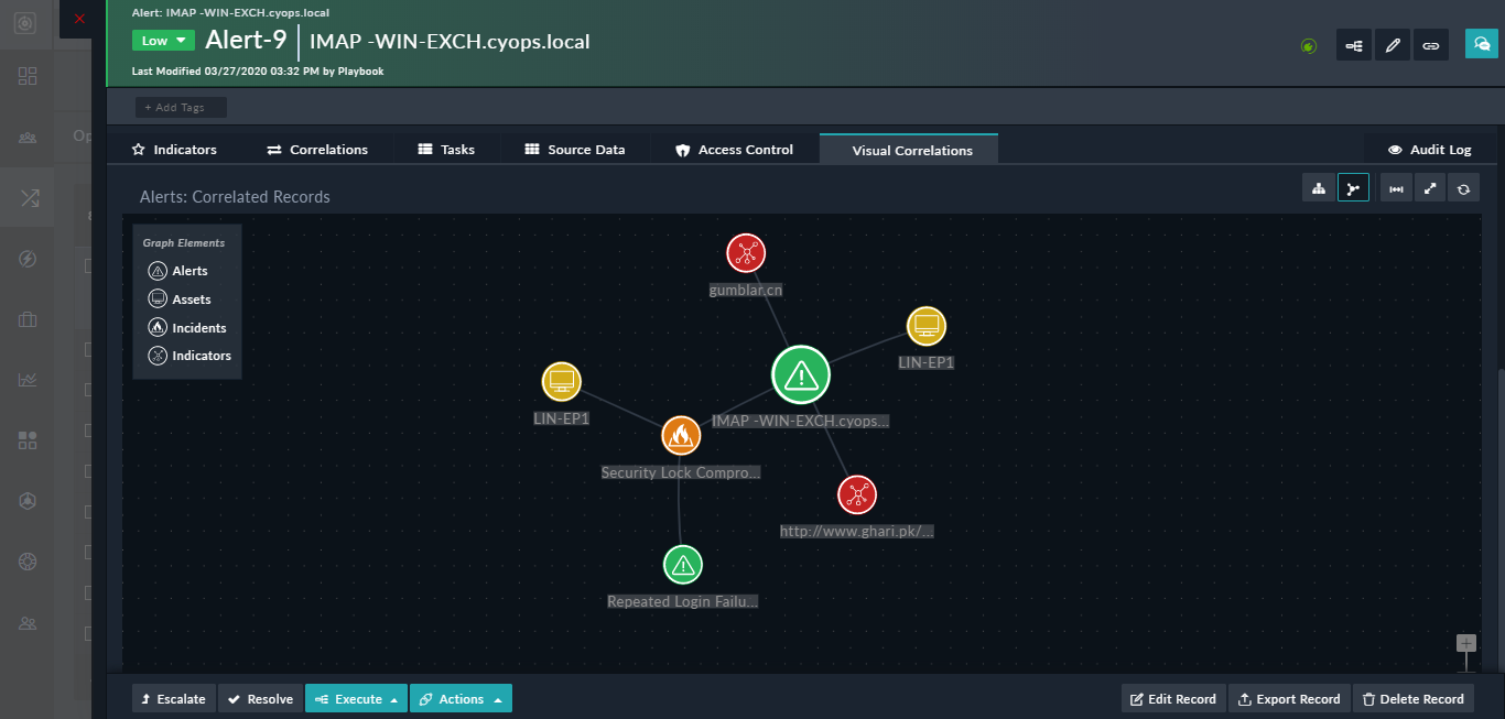
- A "context menu" to the related nodes that contains options to open the related record as shown in the following image:

You can choose to open the record in the current tab itself by clicking the Open Record option in the context menu or you can open the record in the new tab by clicking the Open Record in New Tab option. This is especially useful in cases you want to perform certain actions on the related record, such as blocking an indicator without losing the context of the main record. The main node does not have the context menu since the main record is already open.
You can view the Visual Correlations graph in the full-screen by clicking the Full-screen Mode button. To exit the full screen, press ESC.
File Upload
Use the File Upload widget to provide users with an area to attach file records. You can upload files to this area by either dragging and dropping files or by clicking and browsing to a file.
|
|
All files uploaded are referenced in Attachments using the File API. |
In the File Upload widget, you can specify the module in which you want the files to be saved in the Attachments Module field. By default, this is set as Attachments, i.e., when you upload files, using the File Upload widget, the files become part of the Attachments record. Retain the values of the File Field and Name Field as default:

The following image illustrates how the File Upload widget is displayed in the Detail View of a record:

Note: You can also edit the template of the add/edit form for any module and add the File Upload widget to that form. This is useful when you want to create a record with attachments without having to create a many-to-many relationship between the record and the attachments.
Timeline
The Timeline widget inserts a historical timeline for the current record. The Timeline widget is added by default for records created in modules which are installed when you deploy FortiSOAR. If a user creates a new module and publishes that in FortiSOAR, then the Timeline widget is not present. Users must edit the record template for the newly created module and add this widget so that the timeline for records is available. You cannot edit the Timeline widget.

The Timeline widget appears in the Audit Log tab for records created in modules which are installed when you deploy FortiSOAR. The following image illustrates how the Timeline widget is displayed in the Detail View of a record:

|
|
If you link a record that contains Unicode or non-English characters, then in the Timeline widget, you will not see that event (the link event), or you will not be able to see the details of that event. If you link a record with only English characters, the Timeline widget displays correctly. |
You can toggle between the timeline view, grid view, and full-screen view of the of the audit log tab. To move to a full screen view of the audit log, click the Full-screen Mode icon, which opens the audit log in the full screen as shown in the following image:

You can click the side arrows to view details of the event as shown in the above image. To exit the full screen, press ESC, or click the Exit full-screen mode button.
Executed Playbooks
Use the Executed Playbooks widget to view the executed playbook logs associated with the current record or entity. The Executed Playbooks widget is added by default for records created in modules which are installed when you deploy FortiSOAR. If a user creates a new module and publishes that in FortiSOAR, then the Executed Playbooks widget is not present. Users must edit the record template for the newly created module and add this widget if they want to view the executed playbooks logs associated with the current entity. You cannot edit the Executed Playbooks widget.

The Executed Playbooks widget appears in the Playbooks tab for records created in modules which are installed when you deploy FortiSOAR. The following image illustrates how the Executed Playbooks widget is displayed in the Detail View of a record:

Recommendation Settings
You can add the Recommendation Settings widget in the detail view of a record to display similar records and predict values of fields. You can turn this widget on or off as per your requirement and also configure the settings for displaying similar records and predicting values of fields. For more information on how to configure this widget, see the Working with Modules - Alerts & Incidents chapter.
Custom Content
iFrame
You can use the iFrame widget to display any external HTML page inside an HTML iFrame component. The iFrame widget is present in the Dashboard and List Views templates.
|
Use the iFrame widget responsibly. FortiSOAR has no control over and assumes no responsibility for, the content, privacy policies, or practices of any third-party websites. Ensure all external HTML pages are verified and approved by your organization's Legal and IT teams. |

|
|
You should not add a Dashboard page as a URL in the iFrame Widget, since adding a dashboard page can lead to recursive calls to other pages, which could cause the iFrame to respond very slowly and FortiSOAR to become unresponsive. |
An example of how you can use iFrame widgets would be that you could embed URLs of external cyber security tools (e.g., hex to ascii or url decoding services) that you often use within this widget. Then, when an alert comes into the system, you can gather the data from the alert and paste it into the iFrame and quickly get analysis for the same, instead of having to jump back and forth between tabs or windows. In some cases, it also helps to avoid using the API route, which has its own limits.
|
|
The iFrame Widget supports websites that have CORS enabled. If FortiSOAR displays a blank frame or an error in the iFrame then check the browser developer tools for more information. |
Richtext Content
Use the Richtext Content widget to include formatted content, including lists and tables, images, and source code in your Dashboard, List Views, and Details View templates.
The Richtext Content widget contains a "HTML WYSIWYG" editor for rendering rich text. An "HTML WYSIWYG" editor is extremely easy to use and it renders the content in HTML and therefore can be used easily at places where HTML needs to be rendered, for example, in an email, without the need for users to write code.
You can add styles such as headings, bold, italics, add lists, tables, and insert links, media, etc. using the "Styling" toolbar provided in the widget. To get help on what an icon in the styling toolbar represents, hover your mouse over that icon. Click the Full Screen icon to move to the full screen view of the widget.

Click the Source code button to view the HTML source for the above content:

If you want to add a button that launches a widget on pages such as the Dashboard, View Panel, Listing, etc., that guides users through some configuration activities, then in the Richtext Content widget, click the Source code button and add the following code:<button id="launchWidget-<name-of-widget>-<version-of-widget>">Button Display Name</button>
where, <name-of-widget>, must match the name (case-sensitive) of the widget that requires to be launched.
For example, <button id="launchWidget-demo-1.0.0">Launch CI/CD Config</button>
You can then format the button by changing its font, color, etc. as per your requirements: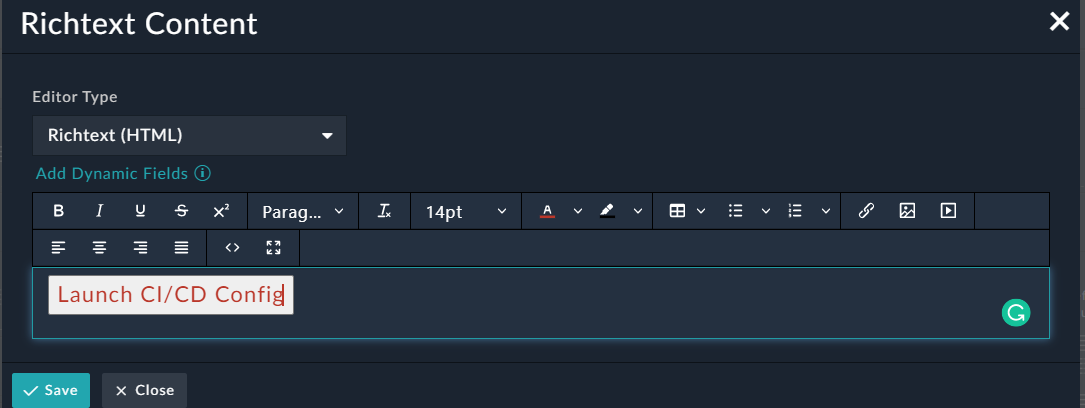
The Launch CI/CD Config button will then be displayed on the page where it has been added. Users can click it to display the widget and perform the activities as defined in the widget.
If you want to add a button that triggers a Manual Trigger or Reference Playbook on pages such as the Dashboard, View Panel, Listing, etc. to perform some operations, then in the Richtext Content widget, click the Source code button and add the following code:"<button id="triggerPlaybook-[PLAYBOOK_UUID]" class="btn-primary">[BUTTON_TITLE]</button>
where, <PLAYBOOK_UUID>, is the UUID of the playbook (manual trigger or reference) that you want to trigger, and BUTTON_TITLE is the actual name of the button.
For example, <button id="triggerPlaybook-cc52222e-ea87-4b1b-be9f-6ca064f1424d" class="btn-primary">Trigger IP Enrichment Playbook</button>: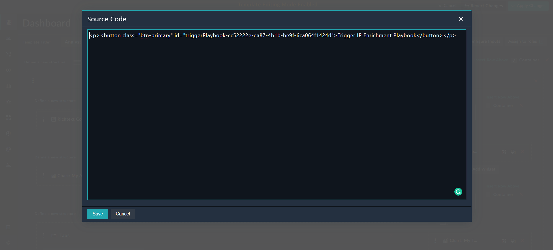
You can then format the button (Trigger IP Enrichment Playbook) by changing its font, color, etc. as per your requirements. .
The Trigger IP Enrichment Playbook button will then be displayed on the page where it has been added. Users can click the button and trigger the configured playbook: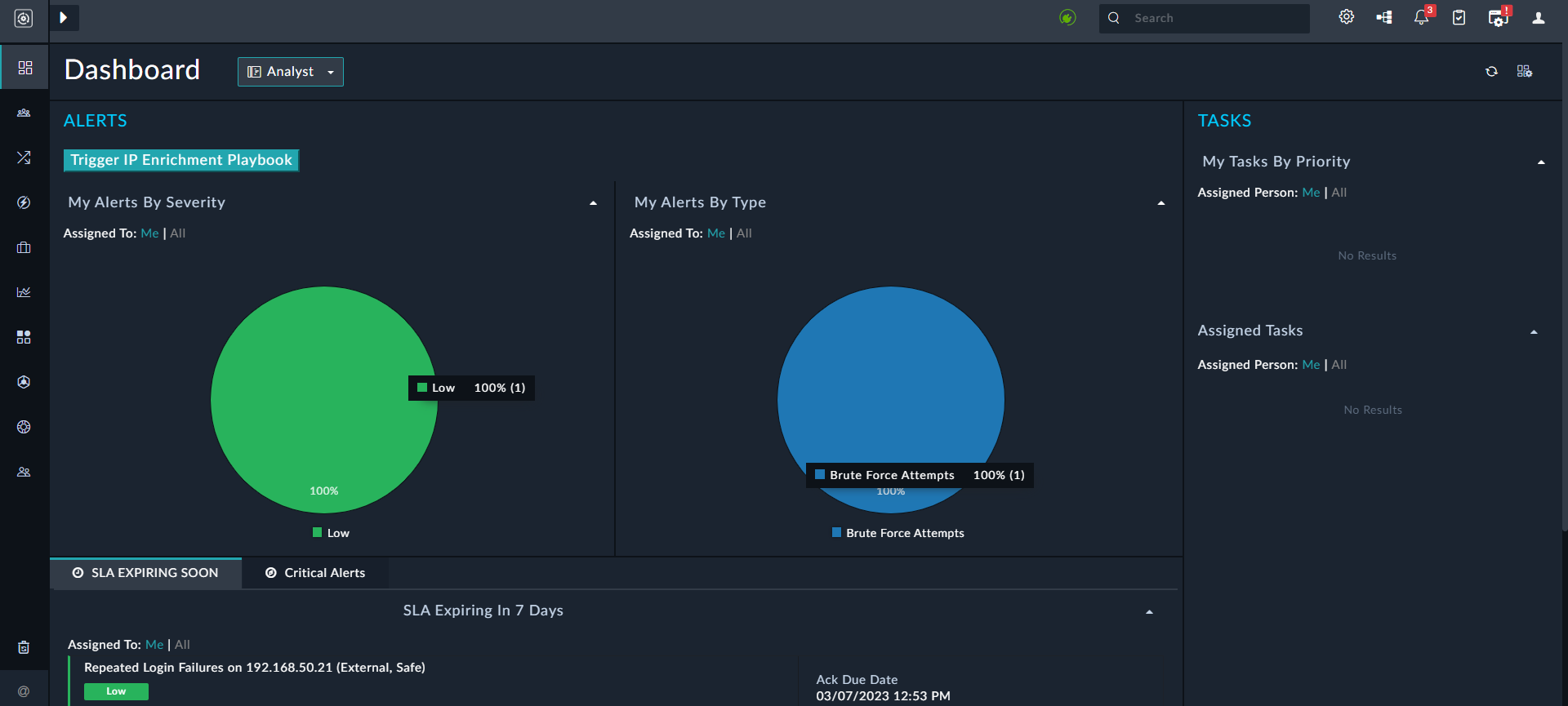
To add a button to launch a playbook in a widget, then you need to update that widget as described in the Adding a button that triggers a Manual Trigger or Reference Playbook in a widget topic of the Widgets Library chapter.
Example of using Richtext Content Widget
In our example, we have arranged alerts according to their source, for example, alerts that are from Splunk in one category and alerts from another source in another category as shown in the following image:

The Alerts Details Listing view will appear as follows, based on the template you have defined:

In the context of Dashboards or Reports, you can also use the identifiers defined in the input variables as part of the Richtext Content. For more information, see the Input Variables in Dashboards and Reports section.
For example, if you are creating a dashboard or a report for a particular Incident ID, then you can add the identifier ({{identifier}}) for the Incident ID that you have defined as the input variable to the Richtext content as Incident Id: {{identifier}}. Based on the value you have specified in Inputs (for example 626), the Richtext content will display Incident ID: 626 on the report or dashboard you are creating. For more information, see the Related Records Filter in Widgets section. Similarly, you can also use {{todayDate}} to display the current date in a dashboard or report.
In the context of Dashboards or Reports, you can also choose the dynamic fields that you want to display in the Richtext Content, making it simpler and efficient for you to add dynamic fields to the Richtext Content.
Do the following, if for example, you want to add a Richtext Content widget, in the Incident Summary Report, which contains the following fields: name of the incident and the date the incident was created on.
- Click the Add Dynamic Fields link that appears at the top of the RichText Content Widget.
- From the Field Type drop-list, select the type of dynamic field you want to add. You can choose from Record Fields, Configured Input Fields, or Utility Fields.
Record Fields are fields that are part of the module that you select from the Data Source drop-down list. Based on the module that you select and the provided record ID, using either a specific record ID or a pre-defined configured input variable, you can add fields from the records.
Configured Input Fields are fields that you have defined earlier as input variables (see Input variables). These fields allow you to add defined report input fields, and pull the value dynamically based on the input parameters specified at the time of running the report.
Utility Fields are dynamic fields commonly used to add dynamic content, such astodayDateandtimezone. - For our example, we need to add the name of the incident and the date the incident was created on. To add the
NameandCreated onfields in the Richtext Content widget, do the following:- From the Field Type drop-down list, select Record Fields.
- From the Data Source drop-down list, select Incidents.
Once you click Incidents, the Incidents ID field is displayed. The Incidents ID field is the<Module ID>field that specifies the ID of the record from which you want to pick up the content of the dynamic field. You can either provide a unique ID (i.e., the ID of a particular incident like626) or select an ID dynamically from the list of input parameters you have configured. In case of our example, an identifier, IncidentID, has been defined as an input variable. Therefore, in our example, the Incidents ID field is displayed withIDselected. You should click the Add Custom Expression button and from the Select variable drop-down list, select IncidentID. This means that users will provide the Incident ID ({{incidentID}}) at the time they run the Incident Summary Report. - To add the
Namefield, from the Field drop-down list, select Name and then click Add Field.
This will paste the jinja value of the Name field, i.e.,{{name}}in the Richtext Content widget on the location where your cursor is placed. - To add the
Created Onfield, from the Field drop-down list, select Created On and then click Add Field.
This will paste the jinja value of the Created On field, i.e.,{{createDate}}in the Richtext Content widget on the location where your cursor is placed.
Important Points:
- Once you add a dynamic field to the Richtext Content widget, you cannot edit this field, also when you hover on the added field, you will see the context of field. In the above image, the Incident ID is undefined since we have used an input variable in the Incident ID field, which means that the user running the record will require to provide the Incident ID at the time of running the report by clicking Input and entering the Incident ID.
- In case of Record Fields, you must add dynamic fields for a single module, for example the name and description of an incident record. If you add dynamic fields for multiple modules, the dynamic fields for the last specified module are considered.
For example, if you have added the name field for the incident module and then you add the name field for the alert module, the Richtext Content widget will display the name only of the alert record and not of the incident record.
Widget Library
You can add widgets such as Access Control, Task Management, etc from the widget library to the detail view of a record. For more information, see the Widget Library chapter.
Common components within Widgets
You can use common components that are part of widgets in the same way across Dashboards and Templates. Some of the common items are:
- Default Sort
- Nested Filters
Default Sort
Default sort is part of the Grids, Card Lists, and Single Line Items widgets. Use Default Sort to specify fields based on which the records in the module will be sorted by default.
Following example describes how to use default sort in a Grid widget:
In the Default Sort section, you can specify fields based on which the records in the module will be sorted by default. Click the Add Sorting Parameter link to get a drop-list of all fields for that module. Select the field based on which you want to sort the records, for example, Due Date, and then select whether you want the records to sort in the Ascending or Descending order.

Nested Filters
Nested Filters is part of all the widgets, except the Custom Content and Structure Widgets. Use Nested filters to filter records using a complex set of conditions. Nested filters group conditions at varying levels and use AND and OR logical operators so that you can filter down to the exact records you require.
|
|
You cannot search or filter encrypted fields. Also, if you want to apply a filter with an |
The Nested Filters component also has the ability to display fields with many-to-many relationships. Earlier, only primitive types and one-to-many relationship fields were displayed in the Nested Filters component. For example, now you can use this component to display all alerts that are associated with a specified Incident ID. An example of this is included in the Related Records Filter in Widgets section. The Select a field drop-down list in Filters now also categorizes fields into Primary Fields and Related Modules making it easier for you to understand whether a field is a field of that module or a field of a related module. For example, for the Incidents Module, Assigned To and Created On would be listed in the Primary Fields section, and Alerts and Assets would be listed in the Related Modules section.
Following example describes how to use Nested Filters in a Chart widget:
In the Filters section, you can add conditions by clicking the Add Condition link or add a condition group by clicking the Add Conditions Group link.
For example, if you want to display alerts in a chart that have been created in the last calendar year and whose severity is critical and whose status is open or investigating, you would create a filter as shown in the following image:

To create nested filters based on the example, perform the following steps:
- For the first condition group, click Add Condition Group, and then do the following:
- In the
Filterssection, select the logical operator, either All of the below are True (AND), or Any of the below is True (OR). For our example, we require the AND operator, since we want alerts that were created in the last year, and whose severity is critical, so select All of the below are True (AND) option. - Click the Add Condition link and create a filter for alerts that have been created in the last year.
From theSelect a fielddrop-down, select Created On, from theOperatordrop-down list select Is in the, select Relative and then from theCreated Ondrop-down list select Last Year. For more information on date/time ranges, see Support for Custom Time Ranges in Filters. - Click the Add Condition link and create another filter for alerts whose severity is critical.
From theSelect a fielddrop-down, select Severity, from theOperatordrop-down list select Equals and, in theSeveritydrop-down list select Critical.
- In the
- Create the second condition group for the status condition, since you require to choose between two conditions in
Status.- Click the Add Conditions Group link and select the logical operator. For our example, we require the OR operator, since we want alerts whose status is Open or Investigating, so select Any of the below is True (OR).
- Click the Add Condition link and create a filter for alerts whose Status is Open.
From theSelect a fielddrop-down, select Status, from theOperatordrop-down list select Equals and, in theStatusdrop-down list select Open. - Click the Add Condition link and create a filter for alerts whose Status is Investigating.
From theSelect a fielddrop-down, select Status, from theOperatordrop-down list select Equals and, in theStatusdrop-down list select Investigating.
- Click Save to save the filter.
Nested filters display logical operators depending on the type of field selected as a filter. For example, if you select a Date/Time field, then you will see the following operators:
- Is in the
- Is Null
- Equals
- Not Equals
- Before
- On or Before
- After
- On or After
Similarly, if you select a field of type Integer you will see the following logical operators:
- Equals
- Not Equals
- Less Than
- Less Than or Equal To
- Greater Than
- Greater Than or Equal To
- Is Null
Or, if you select a field of type Picklist or Lookup you will see the following logical operators:
- Equals
- Not Equals
- Is In List
- Is Not In List
- Is Null
Or, if you select a field of type Text you will see the following logical operators:
- Equals
- Not Equals
- Contains
- Does not Contain
- Matches Pattern
- Does Not Match Pattern
- Is In List
- Is Not In List
- Is Null
The Matches Pattern and Does Not Match Pattern operators allow you to use basic pattern matching in conditional statements using the percent (%) or underscore ( _) wildcards. The % sign represents zero, one, or multiple numbers or characters. The _ sign represents a single number or character.
Support for Custom Time Ranges in Filters
You can define a date range, for Date/Time fields, using the operators mentioned earlier and filter records using the following types of filters:
- Relative Date Ranges, A custom relative date, or a relative date range. A relative date is a date that is relative to the current date. In case of a custom relative date range you define your own relative date range, for example, filtering records in the last 4 days. In case of the relative date range, you can choose from a list of predefined options such as, Last Year.
- Today, i.e., 00:00 hours of the current day to 23:59 hours of the current day.
- Static Date Ranges, For example, filtering records for December 2018, i.e., from 1st December 2018 00:00 hours to 1st January 00:00 hours.
Definitions of time ranges while using the Is in the operator:
- Years and Months: Is the calendar year or months. This filter considers the current year and month, and then applies the filter. For example, if you apply the Last Year filter on 1st February 2019 09:00 hours, then it would be to filter records from 1st January 2018 00:00 hours to 1st February 2019 09:00 hours.
If you apply the Last Month filter on 15th February 2022 09:00 hours, then it would filter records from 15th January 2022 00:00 hours to 15th February 2022 09:00 hours.
Applying the Last Calendar Month filter returns results from the beginning of the last month to the end of the last month. For example, if you apply the Last Calendar Month filter on 15th February 2022 09:00 hours, then it would filter records from 1st January 2022 00:00 hours to 31st January 2022 09:00 hours. - Days: Is the number of days for applying the filter. This filter considers the current day and time and then applies the filter. For example, if you apply the Last 7 Days filter on 4th February 2019 09:00 hours, then records from 29th January 2019 00:00hrs to 4th February 2019 09:00 hours will be considered.
- Hours (and Minutes): Is the hours and minutes for applying the filter. This filter considers the current hour and minute and then applies the filter. For example, if you are applying the Last 24 Hours filter on 5th February 2019 15:30 hours, then records from 4th February 2019 15:00 hours to 5th February 2019 15:30 hours will be considered.
Important: The definition of the relative date time ranges has been simplified and changed in version 6.4.3 to include the current unit of time, for example in case of last x years/months/days/hours/minutes, etc. Earlier the definition used to exclude the current unit of time, for example, the filter would exclude the current hour in case the Last 24 Hours filter was applied. Due to this change if you have used the Is in the operator and you have upgraded your environment from a version prior to 6.4.3, then data will differ after the upgrade.
For the Is in The operator you can choose a relative date or a custom date to filter records. For example, if you have a chart that displays alerts according to the created date, then in the Filter Criteria section when you select the Created On field and the Is in the operator, you will see Relative and Custom options:

If you want to filter records based on a relative date and time, i.e, date and time relative to today, for example, you want the dashboard or report to display all the alerts that were created in the last six months, then click Relative and then select the Last 6 Months option.

Based on this filter the dashboard will display a timeseries of all alerts that were created in the last 6 months. For example, Last 6 Months would be 1st July 2019 00:00 hours to 1st January 2019 09:00 hours, if you are applying this filter on 1st January 2020 09:00 hours.
If you want to filter records on a custom relative date, i.e., if the datetime for which you want to filter records is not present in the predefined list of relative dates, then you can choose the Custom option and specify the relative datetime. For example, if you want the dashboard or report to display all the alerts that were created in the last nine months, then click Custom and then select Last, type 9 in the next text box, and then select Months.

Based on this filter the dashboard will display a timeseries of all alerts that were created in the last 9 months. For example, Last 9 Months would be 1st April 2019 00:00 hours to 1st January 2020 09:00 hours, if you are applying this filter on 1st January 2020 09:00 hours.
|
|
When you are using the Is in the operator and you specify a Custom filter with the same time range as the options present in the Relative filters, then after you save the filter, the filter changes from Custom to Relative. This does not impact any functionality. For example, if you have specified a Custom filter as Is in the Last 1 hour, then after saving this filter when you reopen the template you will observe that the filter has changed to a relative filter since the Last 1 hour option is present in the pre-defined list of Relative filters. |
For the Before, On or Before, After, or On or After operators you can also choose a static date or a relative date based on which you can filter records.
|
|
In case you have upgraded to a version later than 5.0.0, then you will have to reselect your datetime filters, since the new datetime filters are not backward compatible. You will be able to see the older applied datetime filter in the FortiSOAR reports and dashboards. However, if you want to edit these filters, then you will have to reselect all the datetime filters in that dashboard or report. Similarly, if you import a report or dashboard into version 5.0.0 or later, it will work fine. However, if you want to edit the datetime filter, you will have to reselect all the filters in that datetime dashboard or report. |
You can also use variables that you have defined in the Input variables in the Nested Filter component. To use defined input variables, click the Add Custom Expression icon and select the defined input variable. For example, if you have defined the From Date input variable to be used in Dashboards or Reports, select this variable, as shown in the following image:

Behavior of Nested Filters in case of records that have 'null' value
|
|
Records that have a 'null' value in a field are not displayed when you filter records using the Not Equals operator. |
Example:
If you want to define a filter that will retrieve all records whose severity is not equal to critical, you must add the following two conditions to ensure you retrieve all records: Severity Not Equals Critical, and Severity Is Null True. If you add only the Severity Not Equals Critical condition, then records that do not have any Severity assigned to them (null records) will not be retrieved.
Display Elements
You can use the following display elements within widgets to control the behavior and display of fields within widgets:
- All Inline or Inline Editor
- All Read-Only or Read-Only
- All Clickable Links
All Inline or Inline Editor
Selecting the All Inline or Inline Editor checkbox treats all the fields within the widget as inline fields. Inline fields are editable by clicking the fields. If a field is not inline then to edit that field, you must click the Edit button that appears alongside the field.
Read-Only
Selecting the Read-Only checkbox treats all the fields within the widget as read-only fields, irrespective of the permissions assigned.
Clickable Links
Selecting the Clickable Links checkbox converts any URL or email address present in text and textarea fields to hyperlinks, which are clickable.
Note: Links in richtextarea fields are not converted into hyperlinks and therefore not automatically clickable.
Container
Selecting the Container checkbox arranges and styles the widget, which it contains appropriately such that they appear as one cohesive unit.
Insert Row Above
Click the Insert Row Above link to insert a blank row, wherever required.
Displaying "Text Area" fields in the JSON format
You can use the "JSON field" type to store data in the JSON format directly for fields such as Source Data that commonly store data in the JSON format.
The Editable Form Group widget provide you with the ability to display JSON data in the JSON format for fields that have their field type set as Text Area. For example, if alert data is forwarded from a SIEM to FortiSOAR in the JSON format, you can change the Editable Form Group widget to display this data in the JSON format in a JSON viewer instead of the string format.
To enable the option for the JSON viewer in case of Editable Form Group widget:
- Navigate to the module where you want the data to be displayed in JSON format, for example,
Alertsand click a record in this module to open theDetailview of this module. - Click the Edit Template icon to open the Template Editor and modify the interface.
- Click Edit in the
Editable Form Groupand modify the field, whose field type is set asText Area, for example, Source Data, for which you want to display the data in the JSON format.
Click the v icon in the Source Data field to display more options and from the Text Editor drop-down list select JSON: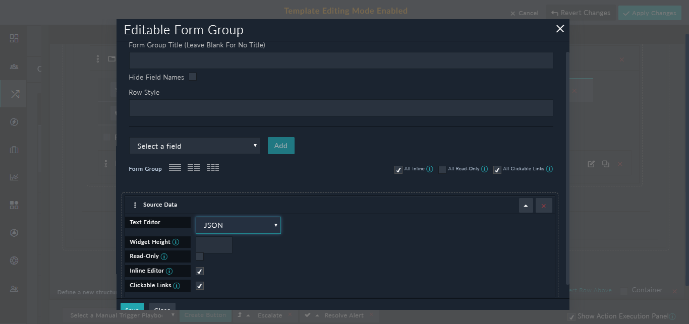
In the Widget Height field, you can define the height, in pixels, of the JSON editor. - Click Save and Apply Changes.
- Open the record in the
Detailview; you will see the field that you have modified is displayed in the JSON viewer as shown in the following image: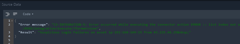
You can edit the JSON directly in the JSON viewer, and if you have made any errors while editing the JSON, the JSON viewer will display a red cross on that line.