


Part 4: Visualization
There are several ways to view and analyze your infrastructure in FortiMonitor. The Infrastructure Map provides a high-level view of your infrastructure and allows you to immediately identify if there is an incident, which instance is affected, and if related instances are also experiencing issues. Dashboards, on the other hand, can be utilized to analyze data and diagnose performance issues in your infrastructure. You can also use a Status Page to expose the current status and historical availability of your infrastructure to your customers and end-users. In addition to the Infrastructure Map, Dashboards, and Status Page, you can also view the status of your infrastructure on the instance level.
Infrastructure Map
Infrastructure Maps provide a high-level view of the health of your infrastructure in FortiMonitor. It allows you to cluster and explore the health of your nodes dynamically, helping you identify problematic hotspots in your infrastructure. The Infrastructure Map is the default page after you have logged in to your FortiMonitor account unless you have configured a default dashboard. You can also access the Infrastructure Map by selecting Monitoring > Infrastructure Map in the header.
The following image and table explain the different components of the Infrastructure Map.


|
A |
Create view |
|
Allows you to create an Infrastructure Map view. A view is a snapshot of your configured clustering and filtering settings. |
|
|
B |
Clusters |
|
Logical grouping of your instances. By default, instances are clustered by instance group. |
|
|
C |
Table |
|
Clicking the table icon displays a view of the configured metrics and status for all instances on the cluster. |
|
|
D |
Nodes |
|
On hover, displays a summary of the instance's configured metrics and health. When you click the node, the Instance Drawer slides out. |
|
|
E |
Add filter |
|
Filter the nodes by tag or server group. |
|
|
F |
Filter by cluster |
|
Cluster the nodes by tag, instance group, cloud region, or cloud instance type. |
See Infrastructure Map for more information.
Dashboard
The Dashboard is a powerful mechanism for displaying and visualizing the various streams of data that are being captured by FortiMonitor. The Dashboard can be configured easily and uses a simple drag and drop builder for widgets in order to achieve the layout you require. In addition, each of the widgets has several options for controlling different elements ranging from formatting, data selection, filtering, and data aggregation.

For more information on how to use Dashboards, see Dashboards.
Widgets
The Dashboard includes a catalog of widgets that you can choose from. Each widget provides a different suite of options for formatting, data selection, and data aggregation. See Dashboard widgets for a list of available widgets.
Time ranges
The time range selection determines what data appears on the Dashboard and widgets. When you select a time range, the aggregated data on the widgets change to reflect the selected time frame. The Dashboard includes preconfigured time ranges that you can choose from. You also have the option to create your own time range. For example, setting the start of the time range to the previous year can provide can help you analyze trends and the past performance of your infrastructure.
Tags
You can use Tags to segment and categorize your infrastructure and Dashboards. Every widget provides options to dynamically display the appropriate infrastructure and metrics by tag, rather than hard-coded selections. This allows your infrastructure to expand and contract as needed without requiring constant changes on what is being shown in your live dashboards. For more information on tagging, see Tags.
Public dashboard
With Public Dashboards, users who are not logged in to FortiMonitor will be able to see Dashboards that you share. To make a Public Dashboard, Select Edit on the Dashboard page then select the Public option. A public URL that you can share will become available.
Multi-tenant dashboard
If you have a multi-tenant account or an MSP, you have the ability to query data and build dashboards across any of the subtenant accounts. This is a powerful method to maintain your single pane of glass view across your different customer segments.
In order to start, create a new dashboard and select the option for Customer Data. This option can only be set on new dashboards and upon initial creation.
For more information see Multi-tenant dashboards.
Instance details page
The Instance Details page exposes all of the relevant information about the instance, including the instance performance, monitoring configuration, incidents, maintenance schedules, availability, and more. Performance-based graphs are displayed in the Performance section of the Instance Details page to help you visualize the status of each metric configured for the instance.
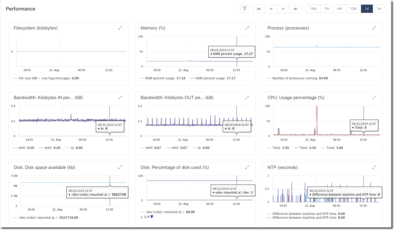
Clicking the expand arrows on the metric will show you a graphical representation of that metric's data and incidents. Any incident will be presented as a red bar in the graph.

See the Instance Details page for more information.
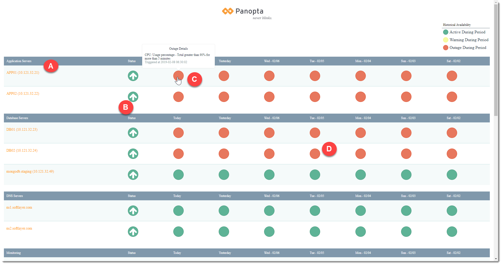
Status page
A Status Page is a tool that you can use to expose your current status and historical availability to your customers and end-users. The Status Page can be used to update your customers about issues such as downtime or maintenance.
The following image and table explain the different components of the Status Page.
|
A |
Instances
|
|
Clicking an instance will display a detailed report for that instance |
|
|
B |
Status for the day |
|
The instance's current status, a green arrow means the instance is up and a means it's down |
|
|
C |
Status on hover |
|
On hover, the status of the instance for that day is displayed |
|
|
D |
Status for the week |
|
The performance of an instance over the past week. A green dot indicates that your server was up all of that day, a yellow dot indicates that there was at least one alert, and a red dot indicates that there was an outage. |
To view an example Status Page, go to http://status.panopta.com/example.